Sunday, August 12, 2012

Hope Springs Eternal

Tom Ohlson has led a pretty remarkable life. He was recently featured on MTV and flew out to meet Mark Zuckerberg. This is quote from his bio.
"After graduating from college, I was certain of only one thing--I did not want a desk job in some office. I worked as a sailing instructor on the beach, a zoologist at a wildlife park, and as a naturalist driving airboats in the Everglades. At the start of the first Gulf War, I joined the U.S. Army and flew as a crash-rescue and medevac pilot. After receiving my discharge from the army, I became a diplomat with the U.S. Department of State and had the good fortune to serve in such places as the Bahamas, Russia, Afghanistan, the U.S. Mission to the United Nations in New York City, and at U.S. Southern Command in Miami."
Tom and I were college room mates but I had lost touch with him over the years. Back in 2009 reconnected with him like so many others on Facebook. I traded posts and "likes" with him and was shocked to hear that he had been living with Amyotrophic lateral sclerosis (Lou Gehrig's disease) since 2005. Early last month, I found this post on my Facebook feed. I hope that you will take time to read it. Hearing from Tom always helps me put life into perspective.

Last week, on the 4th of July, scientists announced they may have discovered the Higgs boson. Frankly, I think if it were not a holiday and if there was nothing else newsworthy taking place, this announcement would have still have received little notice despite the significance of this discovery. This is unfortunate for a myriad of reasons, not the least of which is how American scientific curiosity has been replaced by a need for superficial sensationalism. Don’t take my word for it--just look at the amount of major network news airtime devoted to the Higgs boson announcement vs. the Tom Cruise/Katie Holmes divorce announcement. Still, the discovery of the Higgs boson sounded a clarion call across the planet--great discoveries are still out there to be made and with them, comes great hope.

As we celebrated the birthday of the United States that day, it was evident just how shallow our country had become. In a nation founded by citizen scientists and deep thinkers such as Franklin and Jefferson, we now look at science like Dorothy and her companions viewed the Wizard of Oz--a mysterious force that sometimes grants wishes. Instead of wanting to know how our world works, we only want to know that it works. Instead of learning the issues ourselves, we allow the media, politicians, and PR types to influence our decisions. We have neither the time, nor inclination to learn even the simplest science--unless we learned in school, let others figure it out and we‘ll just go along with what they say. To tell the truth, I was just like most Americans until recently. If not for my diagnosis of ALS, I probably would have remained a Monday morning scientist… “Hey Bob, did you see the eclipse last night?” “Solar, lunar, what’s the difference?” “Did you hear about Tom Cruise and Katie Holmes?“ If it’s not worth watching on the Discovery Channel, it’s not worth knowing. Sad to say, our interest in science has been reduced to how entertaining Hollywood can make it.

Maybe, that’s not a total loss. As a grad student, I once taught a college course in American Government. The course professor insisted each student have a daily subscription to the New York Times. Granted, many in academia would argue that the Times is the gold standard for daily news. However, these were 18- and 19-yr. old undergrads, more interested in the next keg party than the minutia of daily politics. Knowing this, I argued that the students would be much more likely to read the paper if it had simple articles like those found in USA Today--simple was better than nothing. Nevertheless, my argument fell on deaf ears and I can only imagine all those New York Times subscriptions that found the recycling bin before a single article was read. That said, I suppose a glossy, but hollow science segment on TV is better than nothing.

In 2005, I was told I had a terminal illness for which there was no known cause, no viable treatment, and no cure. That was it. I was only in my early 40’s, but I was a dead man walking. Most Americans believe the mantra that if we eat right, exercise, and live within moderation, we will live to a ripe old age. Despite following this instruction manual, I was broken and nobody had replacement parts. I stopped seeing my neurologist, because all he would do is shake his head and mutter how devastating ALS was, and I buried my head in the sand hoping it would all just go away. Didn’t work. As my body slowly rotted away, I desperately looked for answers. Unfortunately, what I discovered was disheartening. No diseases were being cured. Big Pharma had everything geared toward “marketing” medical conditions. There were billions to be made in drugs and treatments to manage disease. Curing them would eliminate all that profit. ALS only effects 30,000 Americans, so developing drugs to treat it offered little financial incentive. I was screwed. So, I started to look outside the pharmaceutical industry for answers. In order to understand what I was looking for, I had to rewire my heretofore keg-seeking brain for science. Not an easy task, but these days I am devoid of a job and a life in general, so I have had the opportunity to do something I never actively did before--study.

The good news--I have found scientific disciplines of which I excel at studying. The bad news--none of them relate to ALS. However, (and this is really the point of this writing) like those undergrads I wanted to have read USA Today, I am now at least able to discern trends and discoveries of significance and I will say this--we are on the verge of a medical revolution, the likes of which have never been witnessed by the human race. That said, we are only at the beginning of this revolution and many of us may never live to reap its benefits. Nevertheless, I have no doubt that a child born today will never have to fear ALS, MS, Alzheimer’s, and most other diseases. Thankfully, Big Pharma has met its match in an even more powerful industry--insurance. The insurance industry has been getting killed by Big Pharma’s “string ‘em along” policy. The insurance industry needs us to either die quickly, or live healthy. Since western society won’t tolerate early death, healthy lifestyles are the only option. So, we see the sudden advent of regenerative medicine, stem cells, gene therapy, etc.

Stem cell therapy alone, is developing at a phenomenal pace. Seven years ago, the best one could hope for was an offshore procedure, which simply transferred cells from one body part to another. Huge controversy surrounded the use of embryos, which were considered the most viable source of stem cells. Today, a patient can use their own cells, which can then be manipulated into the needed cell type, thus avoiding any ethical or rejection issues. Countries free from regulatory and Big Pharma constraints such as Israel and China, are developing stem cell technologies to rival our own. Entire organs are now being created in the lab, paralyzed mice are walking again, and some patients are seeing complete reversals of their medical conditions--all from stem cells. One can only imagine what we will see from stem cells seven years from now!

Seven years ago, there was only one drug available for ALS patients; a drug which prolonged life expectancy a whopping 2-3 months! These days, there are a number of promising drugs currently in clinical trials, with dozens more being looked at. Diaphragm pacers are now prolonging the need for invasive breathing procedures. Reports of ALS patients improving after receiving stem cell treatments both here and in Israel are generating a buzz in the ALS community. Did I contribute to any of these breakthroughs? Of course not. Did my newfound interest in science make a difference? Yes, it saved my life. I cannot overstate that enough. By understanding on at least a very basic level where the science was taking us, I found hope…and hope is what sustains me.

So, what does the Higgs boson have to do with all of this and what’s its significance? Stephen Hawking’s bestseller, “A Brief History of Time” was supposed to be a layman’s guide to understanding these types of theories, but every attempt of mine to read his book resulted in me giving up after two chapters. I am obviously the last person who should attempt to explain the Higgs boson to anyone. In any event, here’s my attempt…. The Higgs boson, also known as the God particle, was first predicted almost 50 years ago. The boson and its corresponding field are the final pieces of one of the most successful physical theories in history--the Standard Model, which encompasses all of nature's fundamental particles, and every fundamental force apart from gravity. The Higgs boson is believed to be a catalyst for the Big Bang and the creation of the universe. That said, the real significance for us mortals who can’t fully grasp all of this is that science persevered. Despite all the crap we now occupy our lives with, despite the dwindling interest in science, despite monetary disincentives, scientific curiosity still exists. Those noble souls who toil away far from the spotlight, let us know that the secrets of the universe are still attainable and through their deeds, hope springs eternal.

Sunday, June 17, 2012

4:20am

The photo is from a trip that my parents took us on to NASA when we were kids. My Father worked on some of the drawings for the Rocket Assembly Tower—the building in the background. Thinking of you today day, Dad. I miss you!

Monday, April 30, 2012

The Wind Through The Keyhole

I'm a huge Stephen King fan like so many others, but somewhere along the lines I slowed my intake and almost stopped, until recently. He is almost too prolific. I had heard of the Dark Tower series but have still not gotten into it. The series was supposed to have wrapped up back in 2004 but he just couldn't leave it alone. Perhaps he has a touch of George RR Martin in him. At any rate, he felt he had one more story in him for Roland, Eddie, Susannah, and Jake and so we have The Wind Through the Keyhole: A Dark Tower Novel. I did read the two books that he wrote with Peter Straub—The Talisman and Black House. I understand that The Talisman was somewhat of a foreshadowing of things to come. I'm sure that I will start reading the series sometime soon, I just hope that they are more in the vein of The Talisman instead The Black House.

Thursday, April 05, 2012

Is Your Mac Infected?

Yes, it is rare. Most Mac users work with the relatively safe feeling that Macs don't get viruses. Don't get lulled into a false sense of security. With the surging popularity of all things Mac, your trusty and reliable Mac is now a target more than ever. And that means you are too!

CNET reports that over 600,000, almost 60% of Mac users in the U.S. alone, are infected with the Flashback botnet/Trojan that was designed to steal sensitive information and send it to identity thieves. The Trojan originally came packaged as a wrongly named Adobe Flash Player plug-in installer back in September. The new tactic, Flashback.N is a modified version that searches for Java vulnerabilities and installs itself when you visit an infected web site. If you have visited one of those sites your computer is at risk. It appears that Flashback is using Twitter to deliver commands and directions.

Apple issued an update for its OS X operating system to patch the problem on April 4. If you want to be sure that you AREN'T infected, there is a manual check that you can perform using Terminal and simple cut-and-paste to see if you are infected.

Sunday, February 12, 2012

The Year of the Dragon

Above is a woodblock print that I made for the year. The first image is the camphor log from which I cut the slab to create the block. The second image is all that is left after the chainsaw. The third is the block itself.
We've been living in the "Year of the Dragon" now for about a month, do you feel lucky yet? For those of you who didn't know, “The Year of the Dragon” is the year of empowerment. It is the fifth of twelve animal signs and is considered to be the luckiest of the Chinese Zodiac. But for me, it isn't about luck or empowerment, it is about being prepared and aware for if you are prepared and aware, then you will be ready to seize the opportunity when it presents itself. Time and again throughout my life, I have been called lucky. When I found the hundred dollar bill floating in the water was one time, but I found it because I was looking when the rest of my family were oblivious because they were lost in the moment and totally in the family reunion moment. I have also heard that I am lucky to be alive. While I believe that luck is generally nothing more than being a bit more aware of your surroundings and capabilities and prepared to seize upon any opportunities that might present themselves, there is something more. Is it karma or some special plan that God has for us? I cannot answer that but I can be ready. Last year’s rabbit had all of us scurrying a bit too much. So, like the dragon, here’s wishing you a magical 2012.

Tuesday, September 13, 2011

WARNING: NACHA is a GOTCHA!

Got this e-mail from transactions@nacha.org this morning:

The ACH transaction (ID: 2************), recently sent from your checking account (by you or any other person), was rejected by the other financial institution.
Rejected transaction Transaction ID: 2************
Rejection Reason See details in the report below Transaction Report report_ 2************.pdf.exe (self-extracting archive, Adobe PDF)
13450 Sunrise Valley Drive, Suite 100 Herndon, VA 20171 (703) 561-1100 2011
NACHA – The Electronic Payments Association


Being on a Mac, I was too worried about an executable file messing up my computer and even if I wanted to I couldn't do much with it. Still didn't want it hanging around. And since I haven't made many electronic transactions recently I was even more suspicious. I didn't bother calling the number at the bottom of the screen as I figured it was a phishing expedition. Besides, anyone could set up a bogus phone line and tell me whatever they wanted me to believe to get my information and… POOF… I am sold off into electronic slavery… no longer the owner of my own name. What I did do, and what YOU SHOULD do any time you receive ANYTHING that requests information or that you click on a report or "visit a site" through a link provided is search the internet. Check Snopes. They have proven reliable in the past but don't stop there, look for the name of the so-calle organization that sent it. See what others might be saying.

I did this and found that quite a number of others have received similar messages. One called the number at the bottom of the so-called official e-mail and got that quick busy signal that one sometimes gets when a phone is out of commission. Snopes had the story. Even the real NACHA seems to be warning people.

Hard times have hit this world. And with it have come a renewed onslaught of people going on phishing organizations. I get e-mail everyday telling me that I won a FIFA lottery, or that I can get millions if only I would allow a poor, dying man a place to deposit his money so I could carry on his noble cause. Be smart people. No one is going to give you money and you haven't won any competitions, especially if you didn't enter them.

Be smart. Be safe. Be ever vigilant.

Monday, March 14, 2011

Game of Thrones (HBO) - "Fear and Blood" teaser


Yes! Winter is Coming! This teaser is probably the best one to explain what The Game of Thrones is all about – especially the first season. It's only a month away now. Read more about the series at HBO or the Winter is Coming blog.

Tuesday, January 04, 2011

REVIEW: The Lost Gate

So, it is finished. This is the first of Orson Scott Card's Mithermages saga. Not having ever read Card in the past, I was completely in the dark as to what he had in store for me. I wasn’t disappointed as The Lost Gate is quite a good read overall. It will be on store shelves and shipping on January 4. There’s a nice follow-up in the back of the book by the author that explains that this story was 30 years in the making… and, for me, worth the wait. The story is described as contemporary urban fantasy. Normally, that would turn me off a bit. I like contemporary fiction and fantasy, but when those words are placed together along with the word urban, it just sounds like someone is trying too hard to be the next Twilight. YA novels generally get too syrupy for my tastes. Mither Mages is a creative attempt to tie all of the world’s mythology into one neat story. This particular tale focuses mainly on a teen named Danny. His family is part of the Norse mythology. An additional story line follows Wad, a mysterious young man who springs from a tree. Both discover that they are gatemages and learn what that means as the story progresses. By the book’s end their stories are tied together. Wad is a compelling character – full of mystery. He ends up living in the kingdom of Iceway. As for Danny, I didn’t much like him early on but his personally fits his character perfectly and Card’s writing quickly hooked me and made me want to know more. The dialog is believable, the characters interesting and the pace had me devoting more time to The Lost Gate than I had to spare. I couldn’t help feeling that there was a sense of doom following Danny and I kept waiting for one of the characters to “get him”. If you want to know more about the story see my earlier post, I have an exerpt, or check out the book's trailer. The world of the Mither Mages that Card has created will entertain readers for years to come. I can’t help but feel a bit helpless after reading this first in a series as I am currently invested in a number of other fantasy sagas and wonder where I will find the time for this new one. Speaking of other sagas, I have cracked open my Christmas present Towers of Midnight. It is the 13th and next to last in the Wheel of Time series by the late Robert Jordan. The last three installments are being finished by the very talented Brandon Sanderson. His last WoT novel, The Gathering Storm was the best that series offered in many years. The book is over 860 pages and with my work load what it is, George R.R. Martin may actually have enough time to finish his next installment in his long over due sage, A Song of Fire and Ice. As much as I am looking forward to reading A Dance with Dragons, I would rather the author take his time and do it right. I know I will be scrambling this April to get a look at the Game of Thrones on HBO. And before I finish, I must give props to Tor, the publisher of The Lost Gate, for going with something other than their traditional bad cover design. One final note, I received my advanced reading copy courtesy of the First Reads program from Goodreads.

Monday, January 03, 2011


Working at MOCA has been one of those dream jobs. For those who know me you've heard that sometimes those dreams are a bit on the nightmarish side what with the insane deadlines and shortened hours. Usually though, it has been a place to grow and learn and work with some amazing people. Being resourceful has also been one of the skills that I have had to hone. Often, a new idea for a fundraiser comes to MOCA all at once and we must all scramble to make things happen. The Art of the Dog was one such event. Unfortunately, it was one of those events that didn't quite make it out of the gate. All the MOCAteers worked like fire ants trying to make this happen but the plug was pulled. Perhaps it will happen this year.

The saying goes that there is always some kind of good that can be found in everything. Sometimes we really have to dig deep. The Art of the Dog made a lot of us extra work when we were all already working over capacity. Some were happy that it didn't happen. Today, I can say that this little doggy is wagging his tail as the logo that I designed for the event will be published in Logo Nest 01.

Thursday, December 30, 2010

GOLO


This is a new logo I designed for a local initiative to promote and support locally owned and operated merchants in Jacksonville, Florida's urban core. GOLO refers to “going local”. The design is a contemporary take on nostalgic design.

Tuesday, December 14, 2010

Next on my Night Stand "The Lost Gate"

I've just started reading The Lost Gate by Orson Scott Card. As I haven't read anything by this author yet I have no idea what to expect. I have high expectations though, as his Ender's Game and the followup Speaker for the Dead were both awarded the Hugo Award and the Nebula Award, making him the only author (as of 2009) to win both of science fiction's top prizes in consecutive years.

So how did I decide to read his newest novel now? Especially when it hasn't yet been released? Well, last week I received an email from Goodreads. Tor, the publisher of The Lost Gate, chose a select few members a part of the First Reads promotion to recieve an advanced copy. First Reads is the Goodreads promotion that regularly gives away advanced copies to generate buzz for upcoming books.

I've reads the first few pages. It's still too early to comment. For now, here's an excerpt.

Danny North knew from early childhood that his family was different, and that he was different from them. While his cousins were learning how to create the things that commoners called fairies, ghosts, golems, trolls, werewolves, and other such miracles that were the heritage of the North family, Danny worried that he would never show a talent, never form an outself.

He grew up in the rambling old house, filled with dozens of cousins, and aunts and uncles, all ruled by his father. Their home was isolated in the mountains of western Virginia, far from town, far from schools, far from other people.

There are many secrets in the House, and many rules that Danny must follow. There is a secret library with only a few dozen books, and none of them in English — but Danny and his cousins are expected to become fluent in the language of the books. While Danny’s cousins are free to create magic whenever they like, they must never do it where outsiders might see.

Unfortunately, there are some secrets kept from Danny as well. And that will lead to disaster for the North family.

Wednesday, September 08, 2010

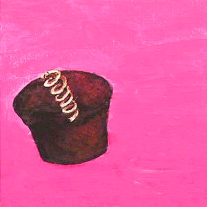
Over Snackarrinated


Last week the museum where I work, MOCA Jacksonville, held an opening for an amazing new exhibition called Imagination Squared. It was a huge collaborative effort by a wide cross-section of people. I participated, just barely, but I am so thankful that I pushed myself and got mine square in with only seconds to spare before the deadline. I am happy, too, not only because I am part of this great event, but also because this was the first time I used acrylics in over 20 years. I suppose it is a little like a bicycle… once you learn…

At any rate, this little painting seemed the perfect fit for this week’s Illustration Friday prompt. I would love to be saying that it is the start of a rededicated weekly practice, but life is still throwing fast balls and I'm still swinging. Soon, dear friends. Soon.

Monday, August 23, 2010

Sneak peak at the new RAP logo

RAP logo
Recently, I have been doing a lot of work as part of the Riverside Avondale Preservation marketing task force. We have been assessing every nook and cranny. Planning for the future and digging into the past which is only fitting seeing as how RAP's started out as a historic preservation organization. Since 1974 it has helped the residents navigate the city's historic preservation code. It started the popular Luminaria, Tour of Homes and recently launched the wildly successful Riverside Arts Market. But I digress… one of the things we realized is that we wanted a fresh, new look… something that would catch the spirit of the district… We still have a lot of work to do… many miles to go before we sleep.

Saturday, July 31, 2010

The Nature of Social Media


There’s an interesting post over at Marketing Profs commenting on a whitepaper from 360i Digital Connections. The whitepaper, Twitter & the Consumer-Marketer Dynamic
is loaded with information on who uses Twitter and how it is used. You’ll have to put aside the fact that they only studied 1,800 tweets over a six month period when, by Twitter’s own numbers “Twitter has more than 100 million registered users that log a collective 65 million tweets each day.”

The interesting story that both the whitepaper and the commentary at Marketing Profs tell is that Twitter is used “primarily for people, not corporations. More than 90% of tweets come from consumers… and only 12% of consumer tweets mention a brand.”
Further, the study informs us that “…94% of tweets are personal (vs. professional/self-promotional), 92% of users keep their tweets public, and 85% of tweets reflect original content (non-RTs).” To me these numbers tell a pretty obvious story, but the whitepaper goes on to tell us that “the opportunity for marketers to become part of the conversation remains vast.”

Twitter, like all social networking sites is opt-in. That means, people are only there because they want to be there. Over at Facebook, the story is a little different. For now, you can “Like” a business or organization’s page and you will receive updates to your wall but you can still opt out if the story is not intriguing or delivering a payoff for listening to their message.

I believe that social networking has exploded in recent years because people are so inundated with advertising and marketing that they need a break and can now take it. If marketers jump in with their old models, they will soon find that their words are falling on deaf ears. Mad Men-style advertising, while fun to watch, is dead. The old agencies are sucking air and still blowing smoke but a new day is dawning. Listening is now the key and the consumer is taking back control.

The YouTube video was found while reading a post on Marketing Profs by Ann Hadley titled "Content Rules: One Key Element That Can Set Your Content Apart."

Monday, February 08, 2010

Ads

The Super Bowl was fun this year. No blow out. The ads were a little disappointing. There were some goods ones early on but it seemed, they slowly moved on. One we didn't see… no not the so-called "banned" one… was an ad from across the pond. It is worth taking a look…

Saturday, January 16, 2010

Dragon


Dragons are mythical creatures that populate almost every culture on earth so I find it hard to believe that they have always been creatures of man's imagination. I do believe that there was once a creature that inspired all the stories and know that I would not like to meet it in the wilderness.

This is a logo that I created for a youth soccer team. Below the logo is a crest that the team used on their jerseys. For those of you who didn't know today is Appreciate a Dragon Day so it is only fitting that this logo finally makes an appearance. Is that my geekiness showing again? Can't help that.

Monday, December 07, 2009

I AM Still Alive…


I've been a little stuck recently. Work has kept me busy, as has the home remodel and family life in general. AND most recently, my wife and I spent a little time in Dublin, Ireland. It was a wonderful and much-needed trip. I think the holidays will be doing me in a bit for the next few weeks, but I will start the New Year’s Resolutions early, so hopefully, I will be posting more. I will definitely be writing more AND illustrating more as I now have three (possibly four) books to illustrate! Speaking of writing more, the image above is from the finished story I participated in via Twitter a while back. I am one of the Twitterverse as I contributed to the story at least four times. I'm not sure if I can now be categorized as a “published” author… but it was fun never-the-less. You can download the story at the BBC Audio America site.

Thursday, October 15, 2009

IF – Flying

No time this week but I did come across some very interesting work over here. I am continually amazed by people's creativity. Speaking of which, I have been having great fun participating in a project by BBC Audiobooks America. I saw a post that read "You can write an original audiobook story on Twitter with New York Times Bestselling Author Neil Gaiman!" and since I do like a good read, I couldn't resist. Neil started out the story and let the Twitterverse take it from there. I've even managed to add a number of tweets to the storyline. If you are interested, you can catch up on the storyline at their blog, head on over to @BBCAA and get in on the fun. The project runs through Friday. At least that is where they believe it will end. The response has been great and they have exceeded their limit a number of times. I look forward to hearing the final story. From a social media aspect, the project has been a great success as well. So far, they have almost quadrupled their followers! Hope to catch you all again real soon.
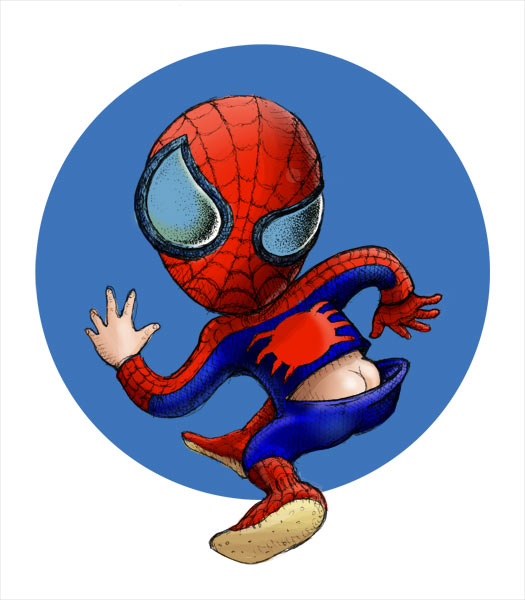
Monday, October 05, 2009

Illustration Friday-GERMS!!!!

germ, n. A pathogenic microorganism; something that may serve as the basis of further growth or development: the germ of a project;

The first thing that sprang to mind was something that causes disease. And every day I look at the news and see that our world is diseased… too many people in this world claim to speak for God… claiming that their way is THE way… but it isn't just the radical Muslims spreading their poison, although we see their terror most visibly… we are almost all guilty of it… every time we judge another… every time we point our fingers… every time we turn our backs… every time we put ourselves first… every day…

John Steinbeck said “A sad soul can kill quicker than a germ.” Too true. Life is moving way too fast… everyone feels it… we all need to slow down and think about the repercussions of our actions… take the time to see who we pass on the street… say hello to the stranger… smile… and let that be the germ that spreads… try it… you'll see…

Tuesday, September 01, 2009

Magnify – Illustration Friday

This is a recently completed illustration that I created for a series of lectures here at MOCA. It has been a while since I gave a talk but I KNOW that my fears are magnified when I step up in front of any crowds. And it doesn't matter how much I prepare, I still get the cold, clammy feeling. Thankfully, that feeling is quickly replaced, especially when I have connected with my audience.

Monday, August 17, 2009

Charles Vess


I've always been a big fan of artists like NC Wyeth, Frank Godwin, Virginia Sterritt and the like. Old school illustrators with talent to spare. They were before my time but copies of the books they illustrated sent me on my own incredible journeys and, I am quite certain, sparked the love of all things fantastic - books, comics, movies and more. They transport me back in time to when I was a pirate or a cowboy… times when I had less worry and responsibility… times gone by… For the most part, those artists have all left us. Some carry the tradition onward, thankfully. My fav is Charles Vess. Even his name is reminiscent of the masters from days gone by. His new book, Drawing Down the Moon is soon to be released. One of his many collaborations with author Neil Gaiman can be seen here with commentary from the artist. It is worth a look. I plan to get it when it is released.

Sunday, August 16, 2009

Stefan Sagmeister: Yes, design can make you happy

The TED series is amazing. I have posted a few in the past. Sagmeister is brilliant here. He reminds me about the fun one can find in design… especially when you are open to new ideas.

Thursday, August 06, 2009

Illustration Friday


I sure do miss Illustration Friday. Thanks to all my friends who have checked in on me over my hiatus and wished me well. Every week I get my e-mail announcing the topic and I am determined to participate… and for a long while, every week I have been pulled in one direction or another. Much of it has been fun. I took my daughter to Universal Studios and road roller coasters. The whole family spent a week in San Diego – the zoo, Sea World, people watching at Comicon, and a week with my oh so fab cousin Annie and her new family. And then there's WORK. It has been a roller coaster ride this summer. I spent June working on website designs for Taleo. The fruits of my labor should be live soon. Freelance projects kept me jumping and then there's MOCA. With all the trips and contract work, I spent much of my time either catching up or making free time.

And I almost forgot… silly me… if you didn't see my earlier post… I dusted off my acting muscles for the 48 Hour Film Project and was part of an award-winning short film. We took home "Best Picture", among others… AND I was fortunate enough to be a part of a group show at MOCA Jacksonville… the work was old… but it did help to light a fire under my…

Waaaaaaaahhhhhhhhhhh!! There it is. I got it out. And I also managed to get an illustration out. And some day I'm going to buy one of these little guys myself and do a little modifying. For now, check these cool designs out!

Monday, June 29, 2009

Echo of Elizabeth

I recently had the opportunity to work on the 48Hour Film Project. Loads of work… lots of fun… We took home the Best 48 Hour Film Project Award as well as the Best Actress, Best Writer and Best Effects awards. Kudos to all who worked on the film, especially Daniel Irizarry, Glen Vanderolen, Manuel Aragon and Jay Pennington who made this film happen. And to the other actors who brought this film to life. And thanks for letting me be a part of it.

Tuesday, June 09, 2009

Help Your Kids Think Outside the Box

…throw it Out!
Wired’s Geek Dad is a fun place to visit. Even if you aren’t a Dad, you'll find fun things to read and a weekly puzzle to challenge your brain. Yesterday, Wired writer Dave Giancaspro told us how he keeps his kids creative (and organized) while still having fun.
So many toys these days have a limited range of play and few options for taking them beyond their intended use. I’ve heard many times from parents and kids to “Just build it the way it’s supposed to be!” The beauty of The Lego Lost and Found Box is there’s no picture on the box. Read more>>
So true. We all like to complain, but then we all allow our children to sit in front of the screen – TV, computer, gaming console – the list goes on and on. Our children deserve better. Our world deserves better.
Photo By Jeanette Giancaspro

Tuesday, June 02, 2009

Illustration Friday – Adapt

Bugsy can't swin…
not even the dog paddle…

poor dog…
but he still knows how to have fun…
adapt or sit on the sidelines!


I've been away from Illustration Friday for way too long. Every Friday, I receive the e-mail and it only made me long for a few minutes, hours or days as it sometimes would take me to participate. I know I only grow as an artist when I do, but I haven't been slacking. Above is one of the many illustrations or logos that I have worked on since I last visited all those weeks ago. I hope my online friends haven't forgotten me. I surely haven't forgotten you.

Saturday, May 30, 2009

Search over URL

I’ve been a member of Marketing Profs for years now. The amount of professional generosity never ceases to amaze me… nor does the stupidity but that is another post entirely. Len Kendall's post “that people are starting to view the Google search bar as their URL entry box” might be a little late out of the box but it should be enough to have you ignoring the rest of this post and typing your company's name in the search bar.

Glad you made it back. What did you see? Was it enough to make you realize that all your carefully planned branding efforts might very well be sharing space with some very unsavory company… and worse… your competition. What am I talking about? Search again and this time take notice of all of the other information in the search results. That's what consumers do.

Len Kendall references Josh Catone’s post at Read, Write, Web. This insightful post informs us about a possible new trend forming here in the States. Trends show that the way people search and the increased use of the mobile web, among others, should be enough for you to consider changing your web strategy. Kellogg’s went as far as purchasing the top sponsored search result for "Special K" on Yahoo! and Google to support their TV ads. Maybe the future is branded search results as Allen Stern of Center Networks points out.

Search over URL is here to stay. And even if you can't afford a national ad campaign or the purchase of top spots in search results, you do have the resources to provided your customers with a well-thought-out and well-designed web site. Evaluate the keywords and content on your site. Eliminate all the junk you think is necessary and simplify your message.

Saturday, May 23, 2009

Crumpling as Identity

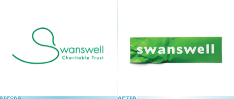
Sometimes the obvious just isn't so obvious until you bring in a professional… or two. Brand New has a post about the retooled Swanswell brand by Brand Guardians. They went on to hire johnson banks to handle the design chores. Swanswell is an agency that helps people with their drug and alcohol dependencies, said, ‘give me a brand my people and service users deserve’. After the usual “brand strategy ‘thing’ (capabilities, competition, customers, vision and mission etc)” they had their ah-ha moment and started to explore the possibilities of using the “well” at the end of the company’s name. “Various typographic experiments followed, before the discovery that a piece of paper, crumpled at one end, could act as a suitable metaphor for someone's life smoothing itself out.” Brand Guardian's Jonathan Mercer points out that he “never tire[s] of telling them brand development is less about invention, and more about archeology. We know the solution is ‘in there somewhere’, it just has to be revealed.” I always knew that, I guess I just hadn't seen it said so well. The simplicity of this design is nothing short of brilliant.

Monday, April 27, 2009

Type Tips – Proportional Vs Tabular Figures


by Ilene Strizver, founder of The Type Studio

Some numbers add up, and others don’t – no, it’s not your tax return. It’s the difference between proportional and tabular numerals. Know which style you need before you choose a typeface and you’ll reap a big savings in time and effort. Tabular numerals are those where each numeral has the same total character width (that’s the width of the numeral itself plus the white space on both sides). Tabular spacing (also referred to as monospacing) allows numerals to align vertically in tables, financial statements and other columns of figures. Tabular figures are usually lining figures, meaning that they sit on the baseline and have the same height as the capital letters, but on occasion you’ll see old style figures that are tabular. (Old style figures are also called lowercase or non-aligning figures.) On the other hand, display typefaces usually contain proportional figures. The total character widths of these figures are based on the width of the numeral itself plus a small amount of white space around it, so an 8 takes up more width than a 1, for example. Proportional figures can be of the lining or old style variety. In either case, their varying widths give them a more even color and texture, especially around the numeral 1. Proportional figures are not intended for use in charts and tables, since they won’t align in vertical columns. When selecting a font for a project, think about how you’ll be using numerals in your design and make sure the font you choose offers the style of figures you need. While it’s fairly simple to kern a tabular 1 to improve its spacing in a text setting, it’s nearly impossible to kern proportional numerals for vertical alignment in a financial statement. For maximum flexibility, consider using OpenType fonts, which are becoming available from more and more foundries. This new font format often comes with both tabular and proportional figures in both lining and old style varieties, but requires using an application that supports this feature.

Editor’s Note: Ilene Strizver, founder of The Type Studio, is a typographic consultant, designer and writer specializing in all aspects of typographic communication. Read more about typography in her latest literary effort, Type Rules!, published by North Light Books. This article was commissioned and approved by Monotype Imaging Inc.

Monday, April 20, 2009

Type Tips – Open Type


by Ilene Strizver, founder of The Type Studio

If you’re a graphic designer and work on a Macintosh system, chances are you typically use PostScript® Type 1 fonts. If you primarily do web design, or work on a Windows machine, you probably use your share of TrueType fonts. Both formats have their advantages and disadvantages, but now there’s OpenType – offering the best of both worlds, and much more.
New Features OpenType is a kind of superset of Type 1 and TrueType font formats, with added enhancements. It is backward-compatible with applications that support Type 1 and TrueType fonts (including design applications and printer drivers), and you can mix OpenType fonts with other font formats without a problem. OpenType also offers some remarkable new features that require OpenType-compatible applications. (If you’re using the latest version of your operating system and applications, you may already have this capability – check with the manufacturers to be sure.) Three of these new features that are of particular benefit to designers are multi-platform support, expanded character sets and glyph substitution. Read more about the features…

Editor’s Note: Ilene Strizver, founder of The Type Studio, is a typographic consultant, designer and writer specializing in all aspects of typographic communication. Read more about typography in her latest literary effort, Type Rules!, published by North Light Books. This article was commissioned and approved by Monotype Imaging Inc.

Monday, April 13, 2009

Type Tips – Bullets


From FontShop founder Erik Spiekermann

Use bullets or centered points instead of hyphens (-) when you list items. Bullets are part of the standard character set and are located in the following positions:
option-8 (Mac), ALT+0149 (Windows)
· option-shift-9 (Mac), ALT+0183 (Windows)

Tuesday, April 07, 2009

I Don't Deserve This

About a month ago, I posted my entry for Illustration Friday. My thumb has just about recovered from the abuse of all the carving it took. It is a lot of work but so worth it. It was a woodblock of an ox and offered the remaining few in trade. One of my IF friends, Susan Sanford of ArtSpark Theatre, took me up on the offer. I just received this amazing piece of art. I'm certain I got the better end of this deal.

As for Illustration Friday itself, hopefully, once tax season, Easter and spring break (whew!) are out of the way I can get back to being a bit more regular and friendly.

Monday, April 06, 2009

Type Tips – Not Justified

From FontShop founder Erik Spiekermann

Avoid flush settings! Most applications create justified text by hideously stretching and squishing words and spaces. Note that it takes many hours of tedious work to typeset justified text that is truly well-proportioned and legible. For this reason, professionals prefer to use ragged-right composition, either with or without hyphenation, depending on how much line-length variation they wish to allow. This gives the text a more harmonious appearance and makes it easier to read, since all wordspaces have the same width.

If you are up for a history lesson on the origins and use of justified typesetting, ITC's U&lc tackles the subject quite well. And please people, there is no such thing at right- or left-justified type!

Monday, March 30, 2009

Type Tips – Ligatures


From FontShop founder Erik Spiekermann

A ligature is defined as the visual or formal combination of two or three letters into a single character. They consist of letter combinations such as ff, fi, fl, ffi. Ligatures keep letters from overlapping and improve legibility. For example: affluence, configure, deflate, affinity.

For more info on ligatures, kerning and tracking the Design Center has a pretty good article posted.

Wednesday, March 25, 2009

conTROLL

Yesterday, I posted about CHAOS so it only seems fitting that today should be about CONTROL.
Wired's Clive Thompson has a very informative article about moderating discussion boards in the April issue. The article covers troll control or how to effectively moderate open discussion boards. He starts out with “Obama sucks” and it’s all uphill from there with information on automated moderation like crowdsourcing and disemvoweling and selective invisibility. Take note that banning the offensive “miscreants” only “nurtures their curdled sense of being an oppressed truth-speaker.”

Slashdot uses crowdsourcing to keep thier boards civil. A very basic explanation is that it is a rating system derived from comments about particular posts. The comments come from randomly selected readers who have the this commenting ability only for a short time before others are selected to comment. Disemvowelling is Thompson’s favorite and I would have to agree. Vicious attacks are almost rendered useless by removing all vowels from an offensive post. Teresa Neilsen Hayden, a moderator at Boing Boing uses this method. Selective Invisibility is the most diabolical of them all. The software by Disqus (the company moderates 90,000 blog threads worldwide) is also a ratings based method. The difference here is that a troll with a lot of negative ratings is rendered invisible by everyone but himself.

This is what you get when you open your discussion boards to everyone. You can either hire an army to moderate your boards, eliminate those boards or employ some method to contain the damage. All of these methods walk a very fine line. One one side is a world where the very nasty troll reigns supreme. On the other is Oceania and Big Brother.

Monday, March 23, 2009

Type Tips – Figuring It Out

From FontShop founder Erik Spiekermann

Good text typefaces have “old style”, “text”, or “lowercase” figures – 1234567890 – instead of “lining” ones – 1234567890. Lining figures were originally designed to be used with setting of all capital letters. Lowercase figures blend in better with the text settings, as the figures behave like lowercase letters with ascenders (6 and 8) and descenders (3, 4, 5, 7, 9) and x-height-only characters (1, 2, 0). While they fit in text very nicely, the good looks have one disadvantage: each of the figures have individual widths, meaning they won’t sit directly underneath each other in columns. Their descenders may also clash with ascenders when the columns sit closely on top of one another, as happens quite often in tabular settings. Lining figures are, however, all the same width, making for a somewhat uneven appearance, as the 1 takes up the same space as the 8, but in tables, they are much easier to add up. Some fonts offer “tabular oldstyle figures”, which will allow table setting.

Read more about figure styles.

Friday, March 20, 2009

Legendary

I guess I have been on somewhat of a superhero kick recently and last week's IF prompt Legenday fits the bill so I did a quick sketch of the Man of Steel. I had lunch with a friend last week and he told me about a story about Richie Havens. Havens. The story he related shared a number of life lessons that Richie Havens learned and how they revealed themselves at strange and unexpected times throughout his life. One of those awakenings was in the 1950s and tales of playing stickball growing up in Brooklyn, inspiring his mother’s wrath (“If your mother doesn’t believe you, no one will…”) and explaining his admiration for Superman as being driven by the fact that he “did what the cops couldn’t do”. HIs father told him that there were no heroes like the ones in the comic books, but I would imagine that somewhere inside he held on to the belief that somewhere this were such being. The George Reeves "Superman" television show changed it all for him and even at a young age got him thinking about the world we live in. This incarnation of the man from Krypton added a little something to the Superman mythology and in so doing revealed a little something about this great country in which we live. “Truth, justice AND the American way.” Four words added to the tagline opened his eyes. It also made him think. We always thought truth and justice WAS the American way. “You see how they fool us."

Monday, March 16, 2009

Type Tips – Smart Quotes

From FontShop founder Erik Spiekermann

A dead giveaway for unprofessional “desktop typography” are wrong quotes and apostrophes. Quotes can have different shapes. They generally look like “this”, and can be remembered as beginning and ending quotes by thinking of “66” and “99”. Beginning quotes are found on the Mac by pressing option-[; closing quotes, option-shift-[. The apostrophe is simply a raised comma, the shape of a ’9 in most typefaces. It is identical to the closing single quote, while the open single quote looks like a ‘6. Beginning single quotes are found on the Mac by pressing option-]; the apostrophe and closing single quote, option-shift-].

And don't get me started on the use of apostrophes. I can't tell you how many times I have tried to fill out a form online only to be told that I need to use a “correct name”. If you are a programmer, please include the apostrophe character. I really want to be correct. U&lc also covers this quite well.

Monday, March 09, 2009

Type Tips – Connections

From FontShop founder Erik Spiekermann

There are three different ways to connect or separate words: the hyphen -, the en dash –, a little wider than the hyphen, and the em dash —, wider still. The regular hyphen is easily accessible on any Mac or PC keyboard, whereas the en dash needs the combination option-hyphen on the Mac. The em dash is accessed by pressing option-shift-hyphen on the Mac. The use of these dashes depends on house styles and tradition. The em dash with no space around it is traditionally used to separate thoughts—like this one—but I think its length is a distraction in running text. Try using the en dash to separate thoughts – like this one – with a character space on either side. En dashes without space on either side are also used between numbers and compound words as in: the shop is open 10–7, while you can take the New York–Kansas City train or the New York–Baltimore train only 8am–3pm.

This is a good, if overly-simple, description of usage from Washington State University. And if that wasn't simple enough for you keep this in mind “Dashes tend to separate elements and hyphens to link them.”

Saturday, March 07, 2009

Illustration Friday - Intricate


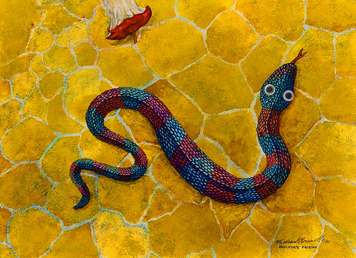
Intricate plots…
Intricate plans…
Physician's friend…
Harmful to man?

I have to admit… this is an old painting. I used to sit for hours in front of the television with my watercolors and get lost. Now it seems I spend more time on Lost than I do painting… much more time spent on family and the never-ending home renovations… This is one of a series of paintings in a very different style that was inspired by my wife when we first started dating… not that a snake or Adam and Eve really have much to do with us… it was just a new path in life…

This one is called Physician's Friend. Water Worries can be seen here. More Than A Mouthful here.

Spring Forward

Daylight Savings Time - STARTS 3/8/09
Before you go to bed tonight, set clocks ahead 1 hour.

As if we don't get too little sleep already.

Friday, March 06, 2009

Monday, March 02, 2009

We Have a Winner!


I just received word that two recent logo designs will be included in the in the forthcoming book Initials & Crests, the first volume in the LogoLounge Master Library series. The selected indentities were developed for the Museum of Contemporary Art Jacksonville and Hercules.

The Avant Garde logo was designed while working in-house and was only used for about a year before the new agency redesigned it. This is the second time this logo has been selected for inclusion in a logo design book. The Dimension logo was designed for internal use at Hercules, a leading a provider of paper and water technologies.

LogoLounge is currently building its Master Logo books. These books will showcase thousands of logos for specific, common logo types (the same categories found in the LogoLounge books), and will be a treasure of reference for logo designers around the world. LogoLounge has become an indispensable tool for logo research, logo inspiration, logo reference and an online portfolio for the international who's who in the corporate identity design community.

Type Tips – The Capital Mistake

From FontShop founder Erik Spiekermann.

NEVER use CAPITAL letters to accentuate words in running copy. They STICK OUT far too much spoiling the LOOK of the column or page. Use italics instead. If you have to set words in capitals, use proper small caps with or without initial capitals.

For more from FontShop about setting type in all caps, read this post.

Saturday, February 28, 2009

Top Ten Typefaces Used by Book Design Winners

FontShop has an interesting article about the recent Book, Jacket & Journal Show sponsored by The American Association of University Presses (AAUP). The annual show catalogs the best in book design and exhibits it around the country. Below is a list of the most popular typefaces that were used in the designs. I can't help but notice that a couple of those near the top are fonts that come bundled with software.

The top ten:
1. Minion
2. ITC New Baskerville
3. FF Scala & 4. FF Scala Sans
5. Adobe Garamond
6. Trade Gothic
7. Electra
8. Fournier
9. Dante
10. DIN


Other popular typefaces used in AAUP winning entries:

Gotham, Helvetica Neue, Akzidenz Grotesk, Futura, Sabon, Bembo, Bodoni, Filosofia, Monotype Grotesque, Interstate, FF Quadraat Sans, FF Clifford

Thursday, February 26, 2009

Too Bad I'm Not in NYC


There has been a lot of discussion recently about Shepard Fairey's work. (More here and here.) I am sure almost everyone has heard about his run-in with the Associated Press. Now it seems he is preemptively suing the them. Oh the trials and tribulations of Fair Use! Regardless of where you stand on the subject, if you are a designer (or lawyer) you have to admit, it is an interesting story to follow. And tonight there is a great panel discussion at the New York Public library featuring Shepard Fairey, Steven Johnson and Lawrence Lessig, who is a Professor of Law at the Stanford Law School and founder of the Center for Internet and Society.

I think much of what he has done is sampling, but I'm not so sure I wouldn't change my tune if he "sampled" my work and made a bundle off it. And apparently, Shaepard Fairey, himself, feels the same way.

The People vs. George Lucas

This looks fun, if not anything else. I don't know if we'll ever see it though. Their website was launched in 2007 and still says that it's coming soon to a theater near you.

Wednesday, February 25, 2009

Instinct - Illustration Friday

Sometimes something just feels right… or wrong…

Intuition is the ability to know things without reasoning or inferring… simply put… you just know something to hold truth. Right now our economy is a mess. We know this. We can't help but knowing this. Everywhere we go we are told how bad things are. And while it may be true, I think most of what we are dealing with is greed. Unfortunately, due to the Bush bailout and the Obama stimulus package those who created this mess don't have to live with the consequences of their greed. The banks and financial institutions who got more and more creative in their interpretation of the laws and basic good sense are now the happy recipients of our money. The automakers who refused to look at the big picture and keep mass-producing SUVs and trucks are facing ruin and the gift of our money. Then there are our neighbors who made a bundle flipping real estate… who bought way more than they could afford… who drive those big SUVs because we are Americans dammit and have the right… the stock traders who drive Wall Street with rabbit's feet and fly balls…

And through it all… good people suffer… hard working people lose their jobs because someone higher up in the food chain got greedy or lazy or just plain stupid… people who made good decisions and saved and didn't double and triple mortgage their houses to buy a new car or take a trip now get to pay the mortgages of our neighbors…

And through all of it… our intuition tells us that this is all very, very wrong… does anyone have an answer?

Friday, February 20, 2009

Friday Battles

Coudal Partners launched a serious Friday afternoon diversion last year with the very special Layer Tennis. Every Firday, it pits two creative types against each other in a design battle with a writer providing colorful play-by-play on the action as it happens. The basic premise is that the competitors swap a file back and forth in real-time with only 15 minutes to add their own touch. Most of the work is down in Illustrator and Photoshop and that only makes sense since Adobe has become a sponsor this year. The match lasts for ten "volleys" and after much commentary from the guest writer and the Season Ticket holders a winner is declared.

This week pits Mitch Ansara (Space Sick) against Rod Hunting with pLAYER-by-pLAYER commentary by Matthew Baldwin of defective yeti.

It's fun… it's raw… and it shouldn't be missed!

Wednesday, February 18, 2009

Celebrate

Gong Xi Fa Choi!
Holding a part time job and starting a business is a lot of work… and time… especially shifting back and forth between the two. The good news is that the freelance clients have been knocking on my door and I haven't yet had time to hang my shingle out… and that is reason to celebrate indeed!

The artwork above is my second woodblock print. The first one I did was a year ago for our annual Chinese New Year card. That one was cut from a cedar tree that I cut down in our front yard to make way for a couple of live oaks. This year, I added another layer in the red "O". The "O" for a lot of reasons… ox, O'Connell, the hope that our new president brings… I cut this year's wood blocks from a camphor tree that came down during Tropical Storm Fay. I carved both pieces back in January and my thumb is still numb!

I did a limited run of 75 prints. I do have a few left… if you are interested… I'm interested in a possible trade…

Friday, February 13, 2009

The Best of Times… The WORST of Times…

… a Couple of Fraud Alerts…
In these hard times, we need to be ever more vigilant. Below are two frauds that are so very clever. The best way to fight this kind of fraud is to say thank you and call whoever is calling you back by using a trusted phone number. Call your local clerk of the courts. Call your credit card company with the number on the back of your card. Check out Snopes. And most of all, remember, if you receive a call from anyone, do NOT give ANY information out to the caller no matter how legitimate they sound. If you have caller ID, write the number down and send it along to the authorities. Stay safe.

Jury Duty
Most of us take those summonses for jury duty seriously, but enough people skip out on their civic duty, that a new and ominous kind of fraud has surfaced.

The caller claims to be a jury coordinator. If you protest that you never received a summons for jury duty, the scammer asks you for your Social Security number and date of birth so he or she can verify the information and cancel the arrest warrant. Give out any of this information and bingo; your identity was just stolen.

The fraud has been reported so far in 11 states, including Oklahoma , Illinois , and Colorado . This (swindle) is particularly insidious because they use intimidation over the phone to try to bully people into giving information by pretending they are with the court system. The FBI and the federal court system have issued nationwide alerts on their web sites, warning consumers about the fraud.

"Credit Card Scam" Scam
This one is pretty slick since they provide YOU with all the information, except the one piece they want. Note, the callers do not ask for your card number; they already have it. This information is worth reading. By understanding how the VISA & MasterCard Telephone Credit Card Scam works, you'll be better prepared to protect yourself.

One of our employees was called on Wednesday from 'VISA ', and I was called on Thursday from 'Master Card'. The scam works like this: Caller: 'This is (name), and I'm calling from the Security and Fraud Department at VISA. My Badge number is 12460. Your card has been flagged for an unusual purchase pattern, and I'm calling to verify. This would be on your VISA card which was issued by (name of bank). Did you purchase an Anti-Telemarketing Device for $497.99 from a Marketing company based in Arizona ?'

When you say 'No', the caller continues with, 'Then we will be issuing a credit to your account. This is a company we have been watching and the charges range from $297 to $497, just under the $500 purchase pattern that flags most cards. Before your next statement, the credit will be sent to (gives you your address), is that correct?'

You say 'yes '. The caller continues - 'I will be starting a Fraud investigation. If you have any questions, you should ca ll the 1- 800 number listed on the back of your card (1-800-VISA) and ask for Security.'

You will need to refer to this Control Number. The caller then gives you a 6 digit number. 'Do you need me to read it again?' Here's the IMPORTANT part on how the scam works. The caller then says, 'I need to verify you are in possession of your card'. He'll ask you to 'turn your card over and look for some numbers'. There are 7 numbers; the first 4 are part of your card number, the next 3 are the security Numbers that verify you are the possessor of the card. These are the numbers you sometimes use to make Internet purchases to prove you have the card. The caller will ask you to read the 3 numbers to him. After you tell the caller the 3 numbers, he'll say, 'That is correct, I just needed to verify that the card has not been lost or stolen, and that you still have your card. Do you have any other questions?' After you say No, the caller then thanks you and states, 'Don't hesitate to call back if you do, and hangs up.

Wednesday, February 11, 2009