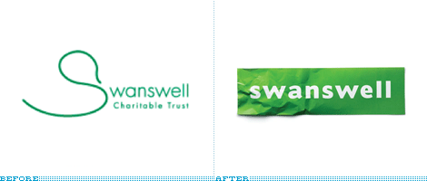
 Sometimes the obvious just isn't so obvious until you bring in a professional… or two. Brand New has a post about the retooled Swanswell brand by Brand Guardians. They went on to hire johnson banks to handle the design chores. Swanswell is an agency that helps people with their drug and alcohol dependencies, said, ‘give me a brand my people and service users deserve’.
After the usual “brand strategy ‘thing’ (capabilities, competition, customers, vision and mission etc)” they had their ah-ha moment and started to explore the possibilities of using the “well” at the end of the company’s name. “Various typographic experiments followed, before the discovery that a piece of paper, crumpled at one end, could act as a suitable metaphor for someone's life smoothing itself out.”
Brand Guardian's Jonathan Mercer points out that he “never tire[s] of telling them brand development is less about invention, and more about archeology. We know the solution is ‘in there somewhere’, it just has to be revealed.” I always knew that, I guess I just hadn't seen it said so well.
The simplicity of this design is nothing short of brilliant.
The rambling thoughts of an author including art, rants, words, book reviews, not-so-subtle suggestions, and more…
Saturday, May 23, 2009
Crumpling as Identity
 Sometimes the obvious just isn't so obvious until you bring in a professional… or two. Brand New has a post about the retooled Swanswell brand by Brand Guardians. They went on to hire johnson banks to handle the design chores. Swanswell is an agency that helps people with their drug and alcohol dependencies, said, ‘give me a brand my people and service users deserve’.
After the usual “brand strategy ‘thing’ (capabilities, competition, customers, vision and mission etc)” they had their ah-ha moment and started to explore the possibilities of using the “well” at the end of the company’s name. “Various typographic experiments followed, before the discovery that a piece of paper, crumpled at one end, could act as a suitable metaphor for someone's life smoothing itself out.”
Brand Guardian's Jonathan Mercer points out that he “never tire[s] of telling them brand development is less about invention, and more about archeology. We know the solution is ‘in there somewhere’, it just has to be revealed.” I always knew that, I guess I just hadn't seen it said so well.
The simplicity of this design is nothing short of brilliant.
Subscribe to:
Post Comments (Atom)
No comments:
Post a Comment