 From FontShop founder Erik Spiekermann
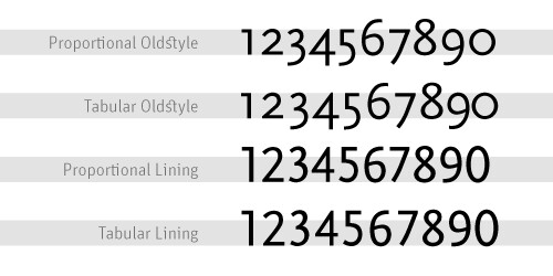
Good text typefaces have “old style”, “text”, or “lowercase” figures – 1234567890 – instead of “lining” ones –
1234567890. Lining figures were originally designed to be used with setting of all capital letters. Lowercase figures blend in better with the text settings, as the figures behave like lowercase letters with ascenders (6 and 8) and descenders (3, 4, 5, 7, 9) and x-height-only characters (1, 2, 0). While they fit in text very nicely, the good looks have one disadvantage: each of the figures have individual widths, meaning they won’t sit directly underneath each other in columns. Their descenders may also clash with ascenders when the columns sit closely on top of one another, as happens quite often in tabular settings. Lining figures are, however, all the same width, making for a somewhat uneven appearance, as the 1 takes up the same space as the 8, but in tables, they are much easier to add up. Some fonts offer “tabular oldstyle figures”, which will allow table setting.Read more about figure styles.
No comments:
Post a Comment