Showing posts with label FontShop. Show all posts

Monday, April 13, 2009

Type Tips – Bullets


From FontShop founder Erik Spiekermann

Use bullets or centered points instead of hyphens (-) when you list items. Bullets are part of the standard character set and are located in the following positions:
option-8 (Mac), ALT+0149 (Windows)
· option-shift-9 (Mac), ALT+0183 (Windows)

Monday, April 06, 2009

Type Tips – Not Justified

From FontShop founder Erik Spiekermann

Avoid flush settings! Most applications create justified text by hideously stretching and squishing words and spaces. Note that it takes many hours of tedious work to typeset justified text that is truly well-proportioned and legible. For this reason, professionals prefer to use ragged-right composition, either with or without hyphenation, depending on how much line-length variation they wish to allow. This gives the text a more harmonious appearance and makes it easier to read, since all wordspaces have the same width.

If you are up for a history lesson on the origins and use of justified typesetting, ITC's U&lc tackles the subject quite well. And please people, there is no such thing at right- or left-justified type!

Monday, March 30, 2009

Type Tips – Ligatures


From FontShop founder Erik Spiekermann

A ligature is defined as the visual or formal combination of two or three letters into a single character. They consist of letter combinations such as ff, fi, fl, ffi. Ligatures keep letters from overlapping and improve legibility. For example: affluence, configure, deflate, affinity.

For more info on ligatures, kerning and tracking the Design Center has a pretty good article posted.

Monday, March 23, 2009

Type Tips – Figuring It Out

From FontShop founder Erik Spiekermann

Good text typefaces have “old style”, “text”, or “lowercase” figures – 1234567890 – instead of “lining” ones – 1234567890. Lining figures were originally designed to be used with setting of all capital letters. Lowercase figures blend in better with the text settings, as the figures behave like lowercase letters with ascenders (6 and 8) and descenders (3, 4, 5, 7, 9) and x-height-only characters (1, 2, 0). While they fit in text very nicely, the good looks have one disadvantage: each of the figures have individual widths, meaning they won’t sit directly underneath each other in columns. Their descenders may also clash with ascenders when the columns sit closely on top of one another, as happens quite often in tabular settings. Lining figures are, however, all the same width, making for a somewhat uneven appearance, as the 1 takes up the same space as the 8, but in tables, they are much easier to add up. Some fonts offer “tabular oldstyle figures”, which will allow table setting.

Read more about figure styles.

Monday, March 16, 2009

Type Tips – Smart Quotes

From FontShop founder Erik Spiekermann

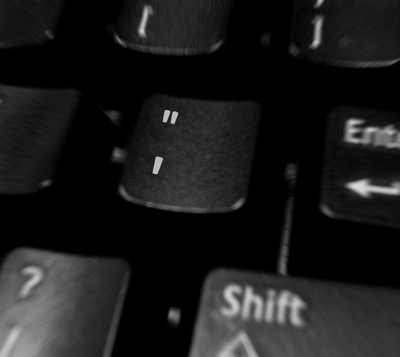
A dead giveaway for unprofessional “desktop typography” are wrong quotes and apostrophes. Quotes can have different shapes. They generally look like “this”, and can be remembered as beginning and ending quotes by thinking of “66” and “99”. Beginning quotes are found on the Mac by pressing option-[; closing quotes, option-shift-[. The apostrophe is simply a raised comma, the shape of a ’9 in most typefaces. It is identical to the closing single quote, while the open single quote looks like a ‘6. Beginning single quotes are found on the Mac by pressing option-]; the apostrophe and closing single quote, option-shift-].

And don't get me started on the use of apostrophes. I can't tell you how many times I have tried to fill out a form online only to be told that I need to use a “correct name”. If you are a programmer, please include the apostrophe character. I really want to be correct. U&lc also covers this quite well.

Monday, March 09, 2009

Type Tips – Connections

From FontShop founder Erik Spiekermann

There are three different ways to connect or separate words: the hyphen -, the en dash –, a little wider than the hyphen, and the em dash —, wider still. The regular hyphen is easily accessible on any Mac or PC keyboard, whereas the en dash needs the combination option-hyphen on the Mac. The em dash is accessed by pressing option-shift-hyphen on the Mac. The use of these dashes depends on house styles and tradition. The em dash with no space around it is traditionally used to separate thoughts—like this one—but I think its length is a distraction in running text. Try using the en dash to separate thoughts – like this one – with a character space on either side. En dashes without space on either side are also used between numbers and compound words as in: the shop is open 10–7, while you can take the New York–Kansas City train or the New York–Baltimore train only 8am–3pm.

This is a good, if overly-simple, description of usage from Washington State University. And if that wasn't simple enough for you keep this in mind “Dashes tend to separate elements and hyphens to link them.”

Monday, March 02, 2009

Type Tips – The Capital Mistake

From FontShop founder Erik Spiekermann.

NEVER use CAPITAL letters to accentuate words in running copy. They STICK OUT far too much spoiling the LOOK of the column or page. Use italics instead. If you have to set words in capitals, use proper small caps with or without initial capitals.

For more from FontShop about setting type in all caps, read this post.

Saturday, February 28, 2009

Top Ten Typefaces Used by Book Design Winners

FontShop has an interesting article about the recent Book, Jacket & Journal Show sponsored by The American Association of University Presses (AAUP). The annual show catalogs the best in book design and exhibits it around the country. Below is a list of the most popular typefaces that were used in the designs. I can't help but notice that a couple of those near the top are fonts that come bundled with software.

The top ten:
1. Minion
2. ITC New Baskerville
3. FF Scala & 4. FF Scala Sans
5. Adobe Garamond
6. Trade Gothic
7. Electra
8. Fournier
9. Dante
10. DIN


Other popular typefaces used in AAUP winning entries:

Gotham, Helvetica Neue, Akzidenz Grotesk, Futura, Sabon, Bembo, Bodoni, Filosofia, Monotype Grotesque, Interstate, FF Quadraat Sans, FF Clifford