The rambling thoughts of an author including art, rants, words, book reviews, not-so-subtle suggestions, and more…
Monday, December 07, 2009
I AM Still Alive…
I've been a little stuck recently. Work has kept me busy, as has the home remodel and family life in general. AND most recently, my wife and I spent a little time in Dublin, Ireland. It was a wonderful and much-needed trip. I think the holidays will be doing me in a bit for the next few weeks, but I will start the New Year’s Resolutions early, so hopefully, I will be posting more. I will definitely be writing more AND illustrating more as I now have three (possibly four) books to illustrate! Speaking of writing more, the image above is from the finished story I participated in via Twitter a while back. I am one of the Twitterverse as I contributed to the story at least four times. I'm not sure if I can now be categorized as a “published” author… but it was fun never-the-less. You can download the story at the BBC Audio America site.
Thursday, October 15, 2009
IF – Flying
 No time this week but I did come across some very interesting work over here. I am continually amazed by people's creativity. Speaking of which, I have been having great fun participating in a project by BBC Audiobooks America. I saw a post that read "You can write an original audiobook story on Twitter with New York Times Bestselling Author Neil Gaiman!" and since I do like a good read, I couldn't resist. Neil started out the story and let the Twitterverse take it from there. I've even managed to add a number of tweets to the storyline. If you are interested, you can catch up on the storyline at their blog, head on over to @BBCAA and get in on the fun. The project runs through Friday. At least that is where they believe it will end. The response has been great and they have exceeded their limit a number of times. I look forward to hearing the final story. From a social media aspect, the project has been a great success as well. So far, they have almost quadrupled their followers!
Hope to catch you all again real soon.
Monday, October 05, 2009
Illustration Friday-GERMS!!!!
 germ, n. A pathogenic microorganism; something that may serve as the basis of further growth or development: the germ of a project;
The first thing that sprang to mind was something that causes disease. And every day I look at the news and see that our world is diseased… too many people in this world claim to speak for God… claiming that their way is THE way… but it isn't just the radical Muslims spreading their poison, although we see their terror most visibly… we are almost all guilty of it… every time we judge another… every time we point our fingers… every time we turn our backs… every time we put ourselves first… every day…
John Steinbeck said “A sad soul can kill quicker than a germ.” Too true. Life is moving way too fast… everyone feels it… we all need to slow down and think about the repercussions of our actions… take the time to see who we pass on the street… say hello to the stranger… smile… and let that be the germ that spreads… try it… you'll see…
Tuesday, September 01, 2009
Magnify – Illustration Friday
 This is a recently completed illustration that I created for a series of lectures here at MOCA. It has been a while since I gave a talk but I KNOW that my fears are magnified when I step up in front of any crowds. And it doesn't matter how much I prepare, I still get the cold, clammy feeling. Thankfully, that feeling is quickly replaced, especially when I have connected with my audience.
Monday, August 17, 2009
Charles Vess
I've always been a big fan of artists like NC Wyeth, Frank Godwin, Virginia Sterritt and the like. Old school illustrators with talent to spare. They were before my time but copies of the books they illustrated sent me on my own incredible journeys and, I am quite certain, sparked the love of all things fantastic - books, comics, movies and more. They transport me back in time to when I was a pirate or a cowboy… times when I had less worry and responsibility… times gone by… For the most part, those artists have all left us. Some carry the tradition onward, thankfully. My fav is Charles Vess. Even his name is reminiscent of the masters from days gone by. His new book, Drawing Down the Moon is soon to be released. One of his many collaborations with author Neil Gaiman can be seen here with commentary from the artist. It is worth a look. I plan to get it when it is released.
Sunday, August 16, 2009
Stefan Sagmeister: Yes, design can make you happy
The TED series is amazing. I have posted a few in the past. Sagmeister is brilliant here. He reminds me about the fun one can find in design… especially when you are open to new ideas.
Thursday, August 06, 2009
Illustration Friday

I sure do miss Illustration Friday. Thanks to all my friends who have checked in on me over my hiatus and wished me well. Every week I get my e-mail announcing the topic and I am determined to participate… and for a long while, every week I have been pulled in one direction or another. Much of it has been fun. I took my daughter to Universal Studios and road roller coasters. The whole family spent a week in San Diego – the zoo, Sea World, people watching at Comicon, and a week with my oh so fab cousin Annie and her new family. And then there's WORK. It has been a roller coaster ride this summer. I spent June working on website designs for Taleo. The fruits of my labor should be live soon. Freelance projects kept me jumping and then there's MOCA. With all the trips and contract work, I spent much of my time either catching up or making free time.
And I almost forgot… silly me… if you didn't see my earlier post… I dusted off my acting muscles for the 48 Hour Film Project and was part of an award-winning short film. We took home "Best Picture", among others… AND I was fortunate enough to be a part of a group show at MOCA Jacksonville… the work was old… but it did help to light a fire under my…
Waaaaaaaahhhhhhhhhhh!! There it is. I got it out. And I also managed to get an illustration out. And some day I'm going to buy one of these little guys myself and do a little modifying. For now, check these cool designs out!
Wednesday, July 08, 2009
The Vendor Client relationship - in real world situations
And now the whole world should be able to understand…
Monday, June 29, 2009
Echo of Elizabeth
I recently had the opportunity to work on the 48Hour Film Project. Loads of work… lots of fun… We took home the Best 48 Hour Film Project Award as well as the Best Actress, Best Writer and Best Effects awards. Kudos to all who worked on the film, especially Daniel Irizarry, Glen Vanderolen, Manuel Aragon and Jay Pennington who made this film happen. And to the other actors who brought this film to life. And thanks for letting me be a part of it.
Tuesday, June 09, 2009
Help Your Kids Think Outside the Box
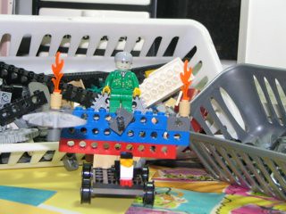 …throw it Out!
So many toys these days have a limited range of play and few options for taking them beyond their intended use. I’ve heard many times from parents and kids to “Just build it the way it’s supposed to be!” The beauty of The Lego Lost and Found Box is there’s no picture on the box. Read more>>
Tuesday, June 02, 2009
Illustration Friday – Adapt
 Bugsy can't swin…
not even the dog paddle…
poor dog…
but he still knows how to have fun…
adapt or sit on the sidelines!
I've been away from Illustration Friday for way too long. Every Friday, I receive the e-mail and it only made me long for a few minutes, hours or days as it sometimes would take me to participate. I know I only grow as an artist when I do, but I haven't been slacking. Above is one of the many illustrations or logos that I have worked on since I last visited all those weeks ago. I hope my online friends haven't forgotten me. I surely haven't forgotten you.
Saturday, May 30, 2009
Search over URL
Glad you made it back. What did you see? Was it enough to make you realize that all your carefully planned branding efforts might very well be sharing space with some very unsavory company… and worse… your competition. What am I talking about? Search again and this time take notice of all of the other information in the search results. That's what consumers do.
Len Kendall references Josh Catone’s post at Read, Write, Web. This insightful post informs us about a possible new trend forming here in the States. Trends show that the way people search and the increased use of the mobile web, among others, should be enough for you to consider changing your web strategy. Kellogg’s went as far as purchasing the top sponsored search result for "Special K" on Yahoo! and Google to support their TV ads. Maybe the future is branded search results as Allen Stern of Center Networks points out.
Search over URL is here to stay. And even if you can't afford a national ad campaign or the purchase of top spots in search results, you do have the resources to provided your customers with a well-thought-out and well-designed web site. Evaluate the keywords and content on your site. Eliminate all the junk you think is necessary and simplify your message.
Saturday, May 23, 2009
Crumpling as Identity
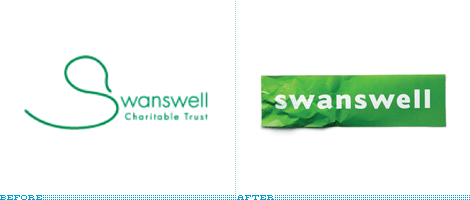 Sometimes the obvious just isn't so obvious until you bring in a professional… or two. Brand New has a post about the retooled Swanswell brand by Brand Guardians. They went on to hire johnson banks to handle the design chores. Swanswell is an agency that helps people with their drug and alcohol dependencies, said, ‘give me a brand my people and service users deserve’.
After the usual “brand strategy ‘thing’ (capabilities, competition, customers, vision and mission etc)” they had their ah-ha moment and started to explore the possibilities of using the “well” at the end of the company’s name. “Various typographic experiments followed, before the discovery that a piece of paper, crumpled at one end, could act as a suitable metaphor for someone's life smoothing itself out.”
Brand Guardian's Jonathan Mercer points out that he “never tire[s] of telling them brand development is less about invention, and more about archeology. We know the solution is ‘in there somewhere’, it just has to be revealed.” I always knew that, I guess I just hadn't seen it said so well.
The simplicity of this design is nothing short of brilliant.
Monday, April 27, 2009
Type Tips – Proportional Vs Tabular Figures

by Ilene Strizver, founder of The Type Studio
Some numbers add up, and others don’t – no, it’s not your tax return. It’s the difference between proportional and tabular numerals. Know which style you need before you choose a typeface and you’ll reap a big savings in time and effort. Tabular numerals are those where each numeral has the same total character width (that’s the width of the numeral itself plus the white space on both sides). Tabular spacing (also referred to as monospacing) allows numerals to align vertically in tables, financial statements and other columns of figures. Tabular figures are usually lining figures, meaning that they sit on the baseline and have the same height as the capital letters, but on occasion you’ll see old style figures that are tabular. (Old style figures are also called lowercase or non-aligning figures.) On the other hand, display typefaces usually contain proportional figures. The total character widths of these figures are based on the width of the numeral itself plus a small amount of white space around it, so an 8 takes up more width than a 1, for example. Proportional figures can be of the lining or old style variety. In either case, their varying widths give them a more even color and texture, especially around the numeral 1. Proportional figures are not intended for use in charts and tables, since they won’t align in vertical columns. When selecting a font for a project, think about how you’ll be using numerals in your design and make sure the font you choose offers the style of figures you need. While it’s fairly simple to kern a tabular 1 to improve its spacing in a text setting, it’s nearly impossible to kern proportional numerals for vertical alignment in a financial statement. For maximum flexibility, consider using OpenType fonts, which are becoming available from more and more foundries. This new font format often comes with both tabular and proportional figures in both lining and old style varieties, but requires using an application that supports this feature.
Editor’s Note: Ilene Strizver, founder of The Type Studio, is a typographic consultant, designer and writer specializing in all aspects of typographic communication. Read more about typography in her latest literary effort, Type Rules!, published by North Light Books. This article was commissioned and approved by Monotype Imaging Inc.
Monday, April 20, 2009
Type Tips – Open Type

by Ilene Strizver, founder of The Type Studio
If you’re a graphic designer and work on a Macintosh system, chances are you typically use PostScript® Type 1 fonts. If you primarily do web design, or work on a Windows machine, you probably use your share of TrueType fonts. Both formats have their advantages and disadvantages, but now there’s OpenType – offering the best of both worlds, and much more. New Features OpenType is a kind of superset of Type 1 and TrueType font formats, with added enhancements. It is backward-compatible with applications that support Type 1 and TrueType fonts (including design applications and printer drivers), and you can mix OpenType fonts with other font formats without a problem. OpenType also offers some remarkable new features that require OpenType-compatible applications. (If you’re using the latest version of your operating system and applications, you may already have this capability – check with the manufacturers to be sure.) Three of these new features that are of particular benefit to designers are multi-platform support, expanded character sets and glyph substitution. Read more about the features…
Editor’s Note: Ilene Strizver, founder of The Type Studio, is a typographic consultant, designer and writer specializing in all aspects of typographic communication. Read more about typography in her latest literary effort, Type Rules!, published by North Light Books. This article was commissioned and approved by Monotype Imaging Inc.
Monday, April 13, 2009
Type Tips – Bullets

From FontShop founder Erik Spiekermann
Use bullets or centered points instead of hyphens (-) when you list items. Bullets are part of the standard character set and are located in the following positions:
•
option-8 (Mac), ALT+0149 (Windows)·
option-shift-9 (Mac), ALT+0183 (Windows)
Tuesday, April 07, 2009
I Don't Deserve This
 About a month ago, I posted my entry for Illustration Friday. My thumb has just about recovered from the abuse of all the carving it took. It is a lot of work but so worth it. It was a woodblock of an ox and offered the remaining few in trade. One of my IF friends, Susan Sanford of ArtSpark Theatre, took me up on the offer. I just received this amazing piece of art. I'm certain I got the better end of this deal.
As for Illustration Friday itself, hopefully, once tax season, Easter and spring break (whew!) are out of the way I can get back to being a bit more regular and friendly.
Monday, April 06, 2009
Type Tips – Not Justified
 From FontShop founder Erik Spiekermann
Avoid flush settings! Most applications create justified text by hideously stretching and squishing words and spaces. Note that it takes many hours of tedious work to typeset justified text that is truly well-proportioned and legible. For this reason, professionals prefer to use ragged-right composition, either with or without hyphenation, depending on how much line-length variation they wish to allow. This gives the text a more harmonious appearance and makes it easier to read, since all wordspaces have the same width.
If you are up for a history lesson on the origins and use of justified typesetting, ITC's U&lc tackles the subject quite well. And please people, there is no such thing at right- or left-justified type!
Monday, March 30, 2009
Type Tips – Ligatures

From FontShop founder Erik Spiekermann
A ligature is defined as the visual or formal combination of two or three letters into a single character. They consist of letter combinations such as ff, fi, fl, ffi. Ligatures keep letters from overlapping and improve legibility. For example: affluence, configure, deflate, affinity.
For more info on ligatures, kerning and tracking the Design Center has a pretty good article posted.
Wednesday, March 25, 2009
conTROLL
 Yesterday, I posted about CHAOS so it only seems fitting that today should be about CONTROL.
Wired's Clive Thompson has a very informative article about moderating discussion boards in the April issue. The article covers troll control or how to effectively moderate open discussion boards. He starts out with “Obama sucks” and it’s all uphill from there with information on automated moderation like crowdsourcing and disemvoweling and selective invisibility. Take note that banning the offensive “miscreants” only “nurtures their curdled sense of being an oppressed truth-speaker.”
Slashdot uses crowdsourcing to keep thier boards civil. A very basic explanation is that it is a rating system derived from comments about particular posts. The comments come from randomly selected readers who have the this commenting ability only for a short time before others are selected to comment. Disemvowelling is Thompson’s favorite and I would have to agree. Vicious attacks are almost rendered useless by removing all vowels from an offensive post. Teresa Neilsen Hayden, a moderator at Boing Boing uses this method. Selective Invisibility is the most diabolical of them all. The software by Disqus (the company moderates 90,000 blog threads worldwide) is also a ratings based method. The difference here is that a troll with a lot of negative ratings is rendered invisible by everyone but himself.
This is what you get when you open your discussion boards to everyone. You can either hire an army to moderate your boards, eliminate those boards or employ some method to contain the damage. All of these methods walk a very fine line. One one side is a world where the very nasty troll reigns supreme. On the other is Oceania and Big Brother.
Monday, March 23, 2009
Type Tips – Figuring It Out
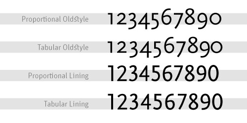 From FontShop founder Erik Spiekermann
Good text typefaces have “old style”, “text”, or “lowercase” figures – 1234567890 – instead of “lining” ones –
1234567890. Lining figures were originally designed to be used with setting of all capital letters. Lowercase figures blend in better with the text settings, as the figures behave like lowercase letters with ascenders (6 and 8) and descenders (3, 4, 5, 7, 9) and x-height-only characters (1, 2, 0). While they fit in text very nicely, the good looks have one disadvantage: each of the figures have individual widths, meaning they won’t sit directly underneath each other in columns. Their descenders may also clash with ascenders when the columns sit closely on top of one another, as happens quite often in tabular settings. Lining figures are, however, all the same width, making for a somewhat uneven appearance, as the 1 takes up the same space as the 8, but in tables, they are much easier to add up. Some fonts offer “tabular oldstyle figures”, which will allow table setting.Read more about figure styles.
Friday, March 20, 2009
Legendary
 I guess I have been on somewhat of a superhero kick recently and last week's IF prompt Legenday fits the bill so I did a quick sketch of the Man of Steel. I had lunch with a friend last week and he told me about a story about Richie Havens. Havens. The story he related shared a number of life lessons that Richie Havens learned and how they revealed themselves at strange and unexpected times throughout his life.
One of those awakenings was in the 1950s and tales of playing stickball growing up in Brooklyn, inspiring his mother’s wrath (“If your mother doesn’t believe you, no one will…”) and explaining his admiration for Superman as being driven by the fact that he “did what the cops couldn’t do”. HIs father told him that there were no heroes like the ones in the comic books, but I would imagine that somewhere inside he held on to the belief that somewhere this were such being. The George Reeves "Superman" television show changed it all for him and even at a young age got him thinking about the world we live in. This incarnation of the man from Krypton added a little something to the Superman mythology and in so doing revealed a little something about this great country in which we live. “Truth, justice AND the American way.” Four words added to the tagline opened his eyes. It also made him think. We always thought truth and justice WAS the American way. “You see how they fool us."
Monday, March 16, 2009
Type Tips – Smart Quotes
 From FontShop founder Erik Spiekermann
A dead giveaway for unprofessional “desktop typography” are wrong quotes and apostrophes. Quotes can have different shapes. They generally look like “this”, and can be remembered as beginning and ending quotes by thinking of “66” and “99”. Beginning quotes are found on the Mac by pressing
option-[; closing quotes, option-shift-[. The apostrophe is simply a raised comma, the shape of a ’9 in most typefaces. It is identical to the closing single quote, while the open single quote looks like a ‘6. Beginning single quotes are found on the Mac by pressing option-]; the apostrophe and closing single quote, option-shift-].And don't get me started on the use of apostrophes. I can't tell you how many times I have tried to fill out a form online only to be told that I need to use a “correct name”. If you are a programmer, please include the apostrophe character. I really want to be correct. U&lc also covers this quite well.
Monday, March 09, 2009
Type Tips – Connections
 From FontShop founder Erik Spiekermann
There are three different ways to connect or separate words: the hyphen -, the en dash –, a little wider than the hyphen, and the em dash —, wider still. The regular hyphen is easily accessible on any Mac or PC keyboard, whereas the en dash needs the combination option-hyphen on the Mac. The em dash is accessed by pressing option-shift-hyphen on the Mac. The use of these dashes depends on house styles and tradition. The em dash with no space around it is traditionally used to separate thoughts—like this one—but I think its length is a distraction in running text. Try using the en dash to separate thoughts – like this one – with a character space on either side. En dashes without space on either side are also used between numbers and compound words as in: the shop is open 10–7, while you can take the New York–Kansas City train or the New York–Baltimore train only 8am–3pm.
This is a good, if overly-simple, description of usage from Washington State University. And if that wasn't simple enough for you keep this in mind “Dashes tend to separate elements and hyphens to link them.”
Saturday, March 07, 2009
Illustration Friday - Intricate
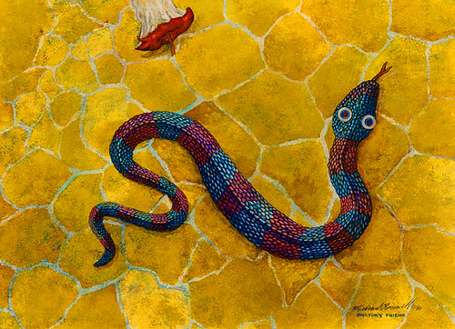
Intricate plans…
Physician's friend…
Harmful to man?
I have to admit… this is an old painting. I used to sit for hours in front of the television with my watercolors and get lost. Now it seems I spend more time on Lost than I do painting… much more time spent on family and the never-ending home renovations… This is one of a series of paintings in a very different style that was inspired by my wife when we first started dating… not that a snake or Adam and Eve really have much to do with us… it was just a new path in life…
This one is called Physician's Friend. Water Worries can be seen here. More Than A Mouthful here.
Spring Forward
Before you go to bed tonight, set clocks ahead 1 hour.
As if we don't get too little sleep already.
Friday, March 06, 2009
Monday, March 02, 2009
We Have a Winner!

I just received word that two recent logo designs will be included in the in the forthcoming book Initials & Crests, the first volume in the LogoLounge Master Library series. The selected indentities were developed for the Museum of Contemporary Art Jacksonville and Hercules.
The Avant Garde logo was designed while working in-house and was only used for about a year before the new agency redesigned it. This is the second time this logo has been selected for inclusion in a logo design book. The Dimension logo was designed for internal use at Hercules, a leading a provider of paper and water technologies.
LogoLounge is currently building its Master Logo books. These books will showcase thousands of logos for specific, common logo types (the same categories found in the LogoLounge books), and will be a treasure of reference for logo designers around the world. LogoLounge has become an indispensable tool for logo research, logo inspiration, logo reference and an online portfolio for the international who's who in the corporate identity design community.
Type Tips – The Capital Mistake
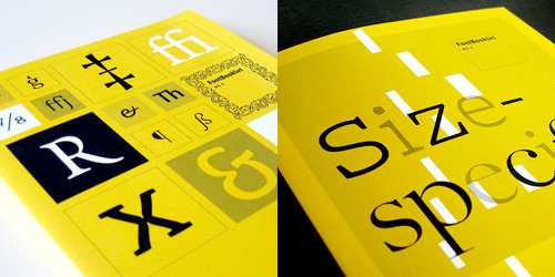 From FontShop founder Erik Spiekermann.
NEVER use CAPITAL letters to accentuate words in running copy. They STICK OUT far too much spoiling the LOOK of the column or page. Use italics instead. If you have to set words in capitals, use proper small caps with or without initial capitals.
For more from FontShop about setting type in all caps, read this post.
Saturday, February 28, 2009
Top Ten Typefaces Used by Book Design Winners
 FontShop has an interesting article about the recent Book, Jacket & Journal Show sponsored by The American Association of University Presses (AAUP). The annual show catalogs the best in book design and exhibits it around the country. Below is a list of the most popular typefaces that were used in the designs. I can't help but notice that a couple of those near the top are fonts that come bundled with software.
The top ten:
1. Minion
2. ITC New Baskerville
3. FF Scala & 4. FF Scala Sans
5. Adobe Garamond
6. Trade Gothic
7. Electra
8. Fournier
9. Dante
10. DIN
Other popular typefaces used in AAUP winning entries:
Gotham, Helvetica Neue, Akzidenz Grotesk, Futura, Sabon, Bembo, Bodoni, Filosofia, Monotype Grotesque, Interstate, FF Quadraat Sans, FF Clifford
Thursday, February 26, 2009
Too Bad I'm Not in NYC

There has been a lot of discussion recently about Shepard Fairey's work. (More here and here.) I am sure almost everyone has heard about his run-in with the Associated Press. Now it seems he is preemptively suing the them. Oh the trials and tribulations of Fair Use! Regardless of where you stand on the subject, if you are a designer (or lawyer) you have to admit, it is an interesting story to follow. And tonight there is a great panel discussion at the New York Public library featuring Shepard Fairey, Steven Johnson and Lawrence Lessig, who is a Professor of Law at the Stanford Law School and founder of the Center for Internet and Society.
I think much of what he has done is sampling, but I'm not so sure I wouldn't change my tune if he "sampled" my work and made a bundle off it. And apparently, Shaepard Fairey, himself, feels the same way.
The People vs. George Lucas
Wednesday, February 25, 2009
Instinct - Illustration Friday
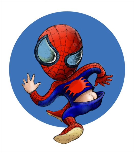 Sometimes something just feels right… or wrong…
 Intuition is the ability to know things without reasoning or inferring… simply put… you just know something to hold truth. Right now our economy is a mess. We know this. We can't help but knowing this. Everywhere we go we are told how bad things are. And while it may be true, I think most of what we are dealing with is greed. Unfortunately, due to the Bush bailout and the Obama stimulus package those who created this mess don't have to live with the consequences of their greed. The banks and financial institutions who got more and more creative in their interpretation of the laws and basic good sense are now the happy recipients of our money. The automakers who refused to look at the big picture and keep mass-producing SUVs and trucks are facing ruin and the gift of our money. Then there are our neighbors who made a bundle flipping real estate… who bought way more than they could afford… who drive those big SUVs because we are Americans dammit and have the right… the stock traders who drive Wall Street with rabbit's feet and fly balls…
And through it all… good people suffer… hard working people lose their jobs because someone higher up in the food chain got greedy or lazy or just plain stupid… people who made good decisions and saved and didn't double and triple mortgage their houses to buy a new car or take a trip now get to pay the mortgages of our neighbors…
And through all of it… our intuition tells us that this is all very, very wrong… does anyone have an answer?
Friday, February 20, 2009
Friday Battles
 Coudal Partners launched a serious Friday afternoon diversion last year with the very special Layer Tennis. Every Firday, it pits two creative types against each other in a design battle with a writer providing colorful play-by-play on the action as it happens. The basic premise is that the competitors swap a file back and forth in real-time with only 15 minutes to add their own touch. Most of the work is down in Illustrator and Photoshop and that only makes sense since Adobe has become a sponsor this year. The match lasts for ten "volleys" and after much commentary from the guest writer and the Season Ticket holders a winner is declared.
This week pits Mitch Ansara (Space Sick) against Rod Hunting with pLAYER-by-pLAYER commentary by Matthew Baldwin of defective yeti.
It's fun… it's raw… and it shouldn't be missed!
Thursday, February 19, 2009
Wednesday, February 18, 2009
Celebrate
 Gong Xi Fa Choi!
Holding a part time job and starting a business is a lot of work… and time… especially shifting back and forth between the two. The good news is that the freelance clients have been knocking on my door and I haven't yet had time to hang my shingle out… and that is reason to celebrate indeed!
The artwork above is my second woodblock print. The first one I did was a year ago for our annual Chinese New Year card. That one was cut from a cedar tree that I cut down in our front yard to make way for a couple of live oaks. This year, I added another layer in the red "O". The "O" for a lot of reasons… ox, O'Connell, the hope that our new president brings… I cut this year's wood blocks from a camphor tree that came down during Tropical Storm Fay. I carved both pieces back in January and my thumb is still numb!
I did a limited run of 75 prints. I do have a few left… if you are interested… I'm interested in a possible trade…
Friday, February 13, 2009
The Best of Times… The WORST of Times…
In these hard times, we need to be ever more vigilant. Below are two frauds that are so very clever. The best way to fight this kind of fraud is to say thank you and call whoever is calling you back by using a trusted phone number. Call your local clerk of the courts. Call your credit card company with the number on the back of your card. Check out Snopes. And most of all, remember, if you receive a call from anyone, do NOT give ANY information out to the caller no matter how legitimate they sound. If you have caller ID, write the number down and send it along to the authorities. Stay safe.
Jury Duty
Most of us take those summonses for jury duty seriously, but enough people skip out on their civic duty, that a new and ominous kind of fraud has surfaced.
The caller claims to be a jury coordinator. If you protest that you never received a summons for jury duty, the scammer asks you for your Social Security number and date of birth so he or she can verify the information and cancel the arrest warrant. Give out any of this information and bingo; your identity was just stolen.
The fraud has been reported so far in 11 states, including Oklahoma , Illinois , and Colorado . This (swindle) is particularly insidious because they use intimidation over the phone to try to bully people into giving information by pretending they are with the court system. The FBI and the federal court system have issued nationwide alerts on their web sites, warning consumers about the fraud.
"Credit Card Scam" Scam
This one is pretty slick since they provide YOU with all the information, except the one piece they want. Note, the callers do not ask for your card number; they already have it. This information is worth reading. By understanding how the VISA & MasterCard Telephone Credit Card Scam works, you'll be better prepared to protect yourself.
One of our employees was called on Wednesday from 'VISA ', and I was called on Thursday from 'Master Card'. The scam works like this: Caller: 'This is (name), and I'm calling from the Security and Fraud Department at VISA. My Badge number is 12460. Your card has been flagged for an unusual purchase pattern, and I'm calling to verify. This would be on your VISA card which was issued by (name of bank). Did you purchase an Anti-Telemarketing Device for $497.99 from a Marketing company based in Arizona ?'
When you say 'No', the caller continues with, 'Then we will be issuing a credit to your account. This is a company we have been watching and the charges range from $297 to $497, just under the $500 purchase pattern that flags most cards. Before your next statement, the credit will be sent to (gives you your address), is that correct?'
You say 'yes '. The caller continues - 'I will be starting a Fraud investigation. If you have any questions, you should ca ll the 1- 800 number listed on the back of your card (1-800-VISA) and ask for Security.'
You will need to refer to this Control Number. The caller then gives you a 6 digit number. 'Do you need me to read it again?' Here's the IMPORTANT part on how the scam works. The caller then says, 'I need to verify you are in possession of your card'. He'll ask you to 'turn your card over and look for some numbers'. There are 7 numbers; the first 4 are part of your card number, the next 3 are the security Numbers that verify you are the possessor of the card. These are the numbers you sometimes use to make Internet purchases to prove you have the card. The caller will ask you to read the 3 numbers to him. After you tell the caller the 3 numbers, he'll say, 'That is correct, I just needed to verify that the card has not been lost or stolen, and that you still have your card. Do you have any other questions?' After you say No, the caller then thanks you and states, 'Don't hesitate to call back if you do, and hangs up.
Wednesday, February 11, 2009
Tuesday, February 10, 2009
Time…
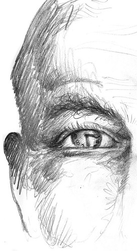 Late again… as usual… but not as bad as last week…
I know that as I get older, time moves by quicker. A minute compared to my entire life is minuscule so, essentially, a minute is shorter for me now. I get that… but come on already! Not this fast! Even small children complain that there is not enough time to do what they need or want to do. I think people are really sick of the pace. From Steampunk to Slow Fashion, the revolution is alive and well. We have so many modern conveniences to make our lives easier that we are drowning in them. On a personal note, we have forgone the landline in favor of our cell phones. And now we are all wired 24/7. I'm not sure if that actually slows the pace but we did do away with cable television. It is amazing just how much I don't miss it. Sure I miss a few shows but my life is slowly getting richer. I read more and have more time to work on the house renovations and, most importanty, more time to spend with my family.
Maybe this economic slow-down is God's answer to our prayers. And that would lead me to remind everyone the we need to be careful what we wish for.
Kreative

The Art of Puro has tagged me as a creative blogger. Of course I am honored, but I sometimes feel like I should pack it all in as I just can't stay consistent. As my upcoming post for Illustration Friday rants, "There is just not enough time!" Then along comes something like this.
So thank you Monica for bringing me back in and giving me the encouragement that I needed. Here are a few others that are more deserving of that honor:
Waldo Walkiria
Carmen Saldaña
Visual Viscera
Go Flying Turtle
Fuhzen 3
Greener Pastures
Dabbled
And in the past I tagged the following people and while I still greatly enjoy the work and their words, I'll pick on a few other great and talented bloggers.
http://marcellomurru.blogspot.com/
http://oohlaladesignstudio.blogspot.com/
http://sentaplyer.blogspot.com/ yes… tagged again…
http://cockyerdoodle.blogspot.com/
http://studiololo.blogspot.com/
http://karenjasper.blogspot.com/
http://artsparktheatre.blogspot.com/
And as for seven things I love? With Valentine's Day just a few days away how could I not start the list with
1. my amazing wife
2. my equally amazing daughter
3. my mother who showed my what the love of a spouse and parent could be like
4. the rest of my family
5. friends (many who are often thought of but are not seen near enough!)
6. creating
7. quiet time
Monday, February 09, 2009
Logical
MARIA: Here it is.
TEACHER: Correct. Now class, who discovered America ?
CLASS: Maria.
____________________________________
TEACHER: John, why are you doing your math multiplication on the floor?
JOHN: You told me to do it without using tables.
__________________________________________
TEACHER: Glenn, how do you spell 'crocodile?'
GLENN: 'K-R-O-K-O-D-I-A-L'
TEACHER: No, that's wrong
GLENN: Maybe it is wrong, but you asked me how I spell it.
____________________________________________
TEACHER: Donald, what is the chemical formula for water?
DONALD: H I J K L M N O.
TEACHER: What are you talking about?
DONALD: Yesterday you said it's H to O.
__________________________________
TEACHER: Winnie, name one important thing we have today that we didn't have ten years ago.
WINNIE: Me!
__________________________________________
TEACHER: Glen, why do you always get so dirty?
GLEN: Well, I'm a lot closer to the ground than you are.
_______________________________________
TEACHER: Sarah, give me a sentence starting with 'I.'
Sarah: I is . . .
TEACHER: No, Sarah . . .. Always say, 'I am.'
Sarah: All right . . . 'I am the ninth letter of the alphabet.'
_________________________________
TEACHER: George Washington not only chopped down his father's cherry tree, but also admitted it. Now, Louie, do you know why his father didn't punish him?
LOUIS: Because George still had the axe in his hand.
______________________________________
TEACHER: Now, Simon, tell me frankly, do you say prayers before eating?
SIMON: No sir, I don't have to, my Mom is a good cook.
______________________________
TEACHER: Clyde, your composition on 'My Dog' is exactly the same as your brother's. Did you copy his?
CLYDE: No, sir. It's the same dog.
___________________________________
TEACHER: Harold, what do you call a person who keeps on talking when people are no longer interested?
HAROLD: A teacher
Thursday, January 29, 2009
The Prince
that starts as a fish…
with newly formed arms
it climbs from the dish…
with forced abdication
it lives for a wish —
that can only be gained
from a well placed kiss…
i wrote this some time ago… i'm not sure it works as a poem… still thinking on it… a riddle maybe… but it does go with the previous post…
Climbing… Illustration Friday
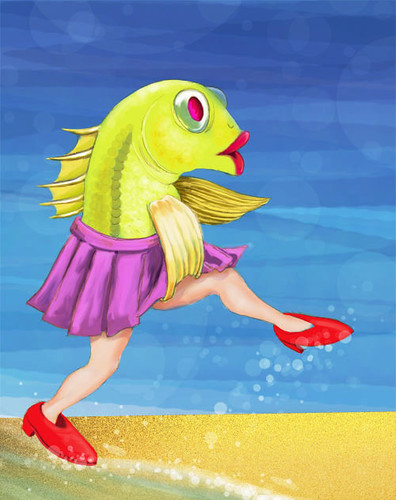
Well, here I am again… just at the buzzer… I think that I have finally gotten on top of all that needed to get done at the Museum. It truly is a great show. Go on… take a look… and if you are in town… stop in… I have an office on the 5th floor.
This little lady has just discovered something new and has climbed out of the soup and is off to see what she can find. I feel the same way right now. After having a nice comfortable place to "live" for the past two-and-a-half-years I am now on to something new… and wonderful… and exciting… AND a bit scary. I know a lot of people are in the same boat right now. Many have lost their jobs. Businesses are cutting away the fat or burning it up in order to stay afloat and I'm not so sure it is ALL bad. It forces us to look at wh we are, where we have been and where we want to go. It also gives us the opportunity to try that "thing" that we always wanted to do. And since I am looking at this from the fishes point of view (cold-blooded) I think many of the companies that are in trouble have gotten too fat and too enslaved to the layers and layers of bureaucracy. How many layers of middle management can a company have without having waste?
Don't get me wrong. I know that there are a lot of people suffering out there. Not only are my thoughts and prayers are with you… I am with you. So pull yourself out of the muck and find that new life. Or if you are in a place to help… reach in and pull someone out. Whatever you do don't stop climbing!
Wednesday, January 21, 2009
Pale

So… buried again! And the year started out so well! That'll teach me to brag! I had hoped to have more time this week and had started working on this illustration not long after the topic came up but I am STILL slammed at work. Someday Alice, POW, right in the kisser! Oh well, on to the illo!
Our world is a bit sick. He's looking a little pale, isn't he? I do believe most of our ills to be of the imaginary ilk. Not that there aren't way too many people suffering… au contraire! We have far too many real problems – lack of decent work, food and above all, adequate education. We invest far too little in our little people. No, the imaginary part comes because we have way too many reactionary idiots controlling the world's fiscal health. Who didn't think that oil prices were unjustly inflated? The Saudis told us that our own greed was driving up the prices. Or that food was way over priced before the CRASH. How stupid is it that when a wrongly spoken word by just the right person can send our entire economy skidding. And then, just because we took ourselves for a ride so do the Asians and Europeans. Or vice versa.
We live in a world of lemmings. People are dying to jump off the cliff with everyone else. So far, it looks like our new President may just be the doctor that we need and bring some change to our country, if not the whole world. Believe me, I do think Rodney King was a thug, but his words do ring true "Please, we can get along here. We all can get along." And all we need to do is use the brains that God gave us. We need to slow down a bit and try to not be so reactionary and afraid.
Friday, January 16, 2009
Summer in Sanctuary: Hip Hop Historic
Don't miss your chance to catch Al Letson's Summer in Sanctuary live January 29-31 at MOCA. With his star on the rise, you may not have to many more opportunities to catch him here in Jacksonville.
Tuesday, January 13, 2009
Contained
 In a recent post Seth Godin talks about rigid boundaries and no boundaries ar all. It's fun to think about just how far you can go but that also has me thinking about the old saying… "give him enough rope and he'll hang himself". Rules are versions of boundaries. In design, to be a good designer I believe you need to know the rules… at least as many of them as possible… so that, if and when necessary, you can break them… or go beyond the boundaries of what is generally accepted. With clients you need to know where you stand and where, under no circumstances, should you go. Sometimes I am that kid that Seth refers to that spends days scheming to get what I want and I know that I am wasting my time. You need to know when it is time to accept that you can't always do the best work possible but you can always give it your best effort with the tools that you are given. You need to know when it is time to stop fighting those monsters and give the client what they ar asking for… no matter what. And hopefully, while doing so, you have an "ah ha" moment and figure out how to give the client what they are asking for AND the best possible work.
Monday, January 12, 2009
41 Hilarious Science Fair Experiments

I have just started poking around the www for some ideas to help my daughter with Science Fair and I couldn't resist posting this. As the website starts by saying… "We should all pity the science teacher, for this is what they deal with on a daily basis."
And yeas… that experiment is "Chrystal Meth: Friend or Foe".
Thursday, January 08, 2009
WAY COOL

Back in December I participated in a contest on Nancy Dorsner's blog Dabbled for the best holiday card. And with much help from friends and family… I won! And she sent me some great swag! If you want some for yourself, give her ArtFire page a visit.
Wednesday, January 07, 2009
Resolve
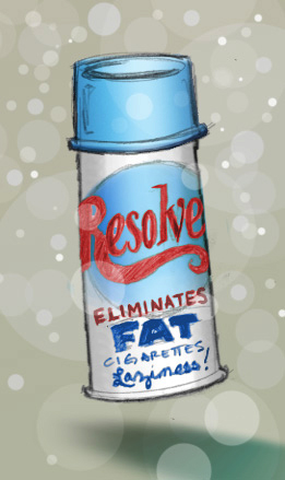 So the New Year starts with a bang. Yada… yada… yada… I resolve… already lost four pounds… woo hoo! And I got done what I told myself that I would get done on my house renovations before going back to work from the holiday break… another woo hoo!
There is so much to do for me at this time of the year. The Museum is keeping me very busy… as is usual right before a new show. Once the show is over, I resolve to add one new client a month… could it be YOU?


