And now the whole world should be able to understand…
The rambling thoughts of an author including art, rants, words, book reviews, not-so-subtle suggestions, and more…
Wednesday, July 08, 2009
Monday, June 29, 2009
Echo of Elizabeth
I recently had the opportunity to work on the 48Hour Film Project. Loads of work… lots of fun… We took home the Best 48 Hour Film Project Award as well as the Best Actress, Best Writer and Best Effects awards. Kudos to all who worked on the film, especially Daniel Irizarry, Glen Vanderolen, Manuel Aragon and Jay Pennington who made this film happen. And to the other actors who brought this film to life. And thanks for letting me be a part of it.
Tuesday, June 09, 2009
Help Your Kids Think Outside the Box
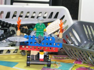 …throw it Out!
Wired’s Geek Dad is a fun place to visit. Even if you aren’t a Dad, you'll find fun things to read and a weekly puzzle to challenge your brain. Yesterday, Wired writer Dave Giancaspro told us how he keeps his kids creative (and organized) while still having fun.
So many toys these days have a limited range of play and few options for taking them beyond their intended use. I’ve heard many times from parents and kids to “Just build it the way it’s supposed to be!” The beauty of The Lego Lost and Found Box is there’s no picture on the box. Read more>>
So true. We all like to complain, but then we all allow our children to sit in front of the screen – TV, computer, gaming console – the list goes on and on. Our children deserve better. Our world deserves better.
Photo By Jeanette Giancaspro
Tuesday, June 02, 2009
Illustration Friday – Adapt
 Bugsy can't swin…
not even the dog paddle…
poor dog…
but he still knows how to have fun…
adapt or sit on the sidelines!
I've been away from Illustration Friday for way too long. Every Friday, I receive the e-mail and it only made me long for a few minutes, hours or days as it sometimes would take me to participate. I know I only grow as an artist when I do, but I haven't been slacking. Above is one of the many illustrations or logos that I have worked on since I last visited all those weeks ago. I hope my online friends haven't forgotten me. I surely haven't forgotten you.
Saturday, May 30, 2009
Search over URL
I’ve been a member of Marketing Profs for years now. The amount of professional generosity never ceases to amaze me… nor does the stupidity but that is another post entirely. Len Kendall's post “that people are starting to view the Google search bar as their URL entry box” might be a little late out of the box but it should be enough to have you ignoring the rest of this post and typing your company's name in the search bar.
Glad you made it back. What did you see? Was it enough to make you realize that all your carefully planned branding efforts might very well be sharing space with some very unsavory company… and worse… your competition. What am I talking about? Search again and this time take notice of all of the other information in the search results. That's what consumers do.
Len Kendall references Josh Catone’s post at Read, Write, Web. This insightful post informs us about a possible new trend forming here in the States. Trends show that the way people search and the increased use of the mobile web, among others, should be enough for you to consider changing your web strategy. Kellogg’s went as far as purchasing the top sponsored search result for "Special K" on Yahoo! and Google to support their TV ads. Maybe the future is branded search results as Allen Stern of Center Networks points out.
Search over URL is here to stay. And even if you can't afford a national ad campaign or the purchase of top spots in search results, you do have the resources to provided your customers with a well-thought-out and well-designed web site. Evaluate the keywords and content on your site. Eliminate all the junk you think is necessary and simplify your message.
Saturday, May 23, 2009
Crumpling as Identity
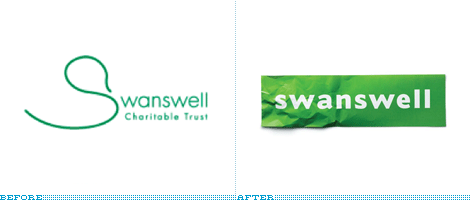 Sometimes the obvious just isn't so obvious until you bring in a professional… or two. Brand New has a post about the retooled Swanswell brand by Brand Guardians. They went on to hire johnson banks to handle the design chores. Swanswell is an agency that helps people with their drug and alcohol dependencies, said, ‘give me a brand my people and service users deserve’.
After the usual “brand strategy ‘thing’ (capabilities, competition, customers, vision and mission etc)” they had their ah-ha moment and started to explore the possibilities of using the “well” at the end of the company’s name. “Various typographic experiments followed, before the discovery that a piece of paper, crumpled at one end, could act as a suitable metaphor for someone's life smoothing itself out.”
Brand Guardian's Jonathan Mercer points out that he “never tire[s] of telling them brand development is less about invention, and more about archeology. We know the solution is ‘in there somewhere’, it just has to be revealed.” I always knew that, I guess I just hadn't seen it said so well.
The simplicity of this design is nothing short of brilliant.
Monday, April 27, 2009
Type Tips – Proportional Vs Tabular Figures

by Ilene Strizver, founder of The Type Studio
Some numbers add up, and others don’t – no, it’s not your tax return. It’s the difference between proportional and tabular numerals. Know which style you need before you choose a typeface and you’ll reap a big savings in time and effort. Tabular numerals are those where each numeral has the same total character width (that’s the width of the numeral itself plus the white space on both sides). Tabular spacing (also referred to as monospacing) allows numerals to align vertically in tables, financial statements and other columns of figures. Tabular figures are usually lining figures, meaning that they sit on the baseline and have the same height as the capital letters, but on occasion you’ll see old style figures that are tabular. (Old style figures are also called lowercase or non-aligning figures.) On the other hand, display typefaces usually contain proportional figures. The total character widths of these figures are based on the width of the numeral itself plus a small amount of white space around it, so an 8 takes up more width than a 1, for example. Proportional figures can be of the lining or old style variety. In either case, their varying widths give them a more even color and texture, especially around the numeral 1. Proportional figures are not intended for use in charts and tables, since they won’t align in vertical columns. When selecting a font for a project, think about how you’ll be using numerals in your design and make sure the font you choose offers the style of figures you need. While it’s fairly simple to kern a tabular 1 to improve its spacing in a text setting, it’s nearly impossible to kern proportional numerals for vertical alignment in a financial statement. For maximum flexibility, consider using OpenType fonts, which are becoming available from more and more foundries. This new font format often comes with both tabular and proportional figures in both lining and old style varieties, but requires using an application that supports this feature.
Editor’s Note: Ilene Strizver, founder of The Type Studio, is a typographic consultant, designer and writer specializing in all aspects of typographic communication. Read more about typography in her latest literary effort, Type Rules!, published by North Light Books. This article was commissioned and approved by Monotype Imaging Inc.
Monday, April 20, 2009
Type Tips – Open Type

by Ilene Strizver, founder of The Type Studio
If you’re a graphic designer and work on a Macintosh system, chances are you typically use PostScript® Type 1 fonts. If you primarily do web design, or work on a Windows machine, you probably use your share of TrueType fonts. Both formats have their advantages and disadvantages, but now there’s OpenType – offering the best of both worlds, and much more. New Features OpenType is a kind of superset of Type 1 and TrueType font formats, with added enhancements. It is backward-compatible with applications that support Type 1 and TrueType fonts (including design applications and printer drivers), and you can mix OpenType fonts with other font formats without a problem. OpenType also offers some remarkable new features that require OpenType-compatible applications. (If you’re using the latest version of your operating system and applications, you may already have this capability – check with the manufacturers to be sure.) Three of these new features that are of particular benefit to designers are multi-platform support, expanded character sets and glyph substitution. Read more about the features…
Editor’s Note: Ilene Strizver, founder of The Type Studio, is a typographic consultant, designer and writer specializing in all aspects of typographic communication. Read more about typography in her latest literary effort, Type Rules!, published by North Light Books. This article was commissioned and approved by Monotype Imaging Inc.
Monday, April 13, 2009
Type Tips – Bullets

From FontShop founder Erik Spiekermann
Use bullets or centered points instead of hyphens (-) when you list items. Bullets are part of the standard character set and are located in the following positions:
•
option-8 (Mac), ALT+0149 (Windows)·
option-shift-9 (Mac), ALT+0183 (Windows)
Tuesday, April 07, 2009
I Don't Deserve This
 About a month ago, I posted my entry for Illustration Friday. My thumb has just about recovered from the abuse of all the carving it took. It is a lot of work but so worth it. It was a woodblock of an ox and offered the remaining few in trade. One of my IF friends, Susan Sanford of ArtSpark Theatre, took me up on the offer. I just received this amazing piece of art. I'm certain I got the better end of this deal.
As for Illustration Friday itself, hopefully, once tax season, Easter and spring break (whew!) are out of the way I can get back to being a bit more regular and friendly.
Monday, April 06, 2009
Type Tips – Not Justified
 From FontShop founder Erik Spiekermann
Avoid flush settings! Most applications create justified text by hideously stretching and squishing words and spaces. Note that it takes many hours of tedious work to typeset justified text that is truly well-proportioned and legible. For this reason, professionals prefer to use ragged-right composition, either with or without hyphenation, depending on how much line-length variation they wish to allow. This gives the text a more harmonious appearance and makes it easier to read, since all wordspaces have the same width.
If you are up for a history lesson on the origins and use of justified typesetting, ITC's U&lc tackles the subject quite well. And please people, there is no such thing at right- or left-justified type!
Monday, March 30, 2009
Type Tips – Ligatures

From FontShop founder Erik Spiekermann
A ligature is defined as the visual or formal combination of two or three letters into a single character. They consist of letter combinations such as ff, fi, fl, ffi. Ligatures keep letters from overlapping and improve legibility. For example: affluence, configure, deflate, affinity.
For more info on ligatures, kerning and tracking the Design Center has a pretty good article posted.
Wednesday, March 25, 2009
conTROLL
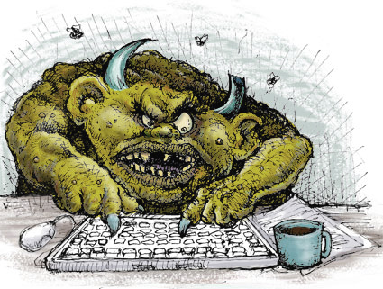 Yesterday, I posted about CHAOS so it only seems fitting that today should be about CONTROL.
Wired's Clive Thompson has a very informative article about moderating discussion boards in the April issue. The article covers troll control or how to effectively moderate open discussion boards. He starts out with “Obama sucks” and it’s all uphill from there with information on automated moderation like crowdsourcing and disemvoweling and selective invisibility. Take note that banning the offensive “miscreants” only “nurtures their curdled sense of being an oppressed truth-speaker.”
Slashdot uses crowdsourcing to keep thier boards civil. A very basic explanation is that it is a rating system derived from comments about particular posts. The comments come from randomly selected readers who have the this commenting ability only for a short time before others are selected to comment. Disemvowelling is Thompson’s favorite and I would have to agree. Vicious attacks are almost rendered useless by removing all vowels from an offensive post. Teresa Neilsen Hayden, a moderator at Boing Boing uses this method. Selective Invisibility is the most diabolical of them all. The software by Disqus (the company moderates 90,000 blog threads worldwide) is also a ratings based method. The difference here is that a troll with a lot of negative ratings is rendered invisible by everyone but himself.
This is what you get when you open your discussion boards to everyone. You can either hire an army to moderate your boards, eliminate those boards or employ some method to contain the damage. All of these methods walk a very fine line. One one side is a world where the very nasty troll reigns supreme. On the other is Oceania and Big Brother.
Monday, March 23, 2009
Type Tips – Figuring It Out
 From FontShop founder Erik Spiekermann
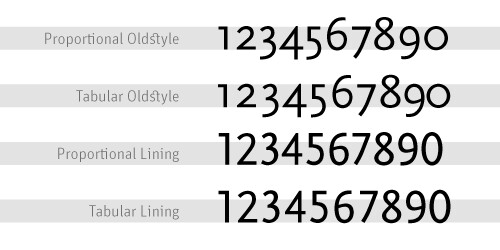
Good text typefaces have “old style”, “text”, or “lowercase” figures – 1234567890 – instead of “lining” ones –
1234567890. Lining figures were originally designed to be used with setting of all capital letters. Lowercase figures blend in better with the text settings, as the figures behave like lowercase letters with ascenders (6 and 8) and descenders (3, 4, 5, 7, 9) and x-height-only characters (1, 2, 0). While they fit in text very nicely, the good looks have one disadvantage: each of the figures have individual widths, meaning they won’t sit directly underneath each other in columns. Their descenders may also clash with ascenders when the columns sit closely on top of one another, as happens quite often in tabular settings. Lining figures are, however, all the same width, making for a somewhat uneven appearance, as the 1 takes up the same space as the 8, but in tables, they are much easier to add up. Some fonts offer “tabular oldstyle figures”, which will allow table setting.Read more about figure styles.
Friday, March 20, 2009
Legendary
 I guess I have been on somewhat of a superhero kick recently and last week's IF prompt Legenday fits the bill so I did a quick sketch of the Man of Steel. I had lunch with a friend last week and he told me about a story about Richie Havens. Havens. The story he related shared a number of life lessons that Richie Havens learned and how they revealed themselves at strange and unexpected times throughout his life.
One of those awakenings was in the 1950s and tales of playing stickball growing up in Brooklyn, inspiring his mother’s wrath (“If your mother doesn’t believe you, no one will…”) and explaining his admiration for Superman as being driven by the fact that he “did what the cops couldn’t do”. HIs father told him that there were no heroes like the ones in the comic books, but I would imagine that somewhere inside he held on to the belief that somewhere this were such being. The George Reeves "Superman" television show changed it all for him and even at a young age got him thinking about the world we live in. This incarnation of the man from Krypton added a little something to the Superman mythology and in so doing revealed a little something about this great country in which we live. “Truth, justice AND the American way.” Four words added to the tagline opened his eyes. It also made him think. We always thought truth and justice WAS the American way. “You see how they fool us."
Monday, March 16, 2009
Type Tips – Smart Quotes
 From FontShop founder Erik Spiekermann
A dead giveaway for unprofessional “desktop typography” are wrong quotes and apostrophes. Quotes can have different shapes. They generally look like “this”, and can be remembered as beginning and ending quotes by thinking of “66” and “99”. Beginning quotes are found on the Mac by pressing
option-[; closing quotes, option-shift-[. The apostrophe is simply a raised comma, the shape of a ’9 in most typefaces. It is identical to the closing single quote, while the open single quote looks like a ‘6. Beginning single quotes are found on the Mac by pressing option-]; the apostrophe and closing single quote, option-shift-].And don't get me started on the use of apostrophes. I can't tell you how many times I have tried to fill out a form online only to be told that I need to use a “correct name”. If you are a programmer, please include the apostrophe character. I really want to be correct. U&lc also covers this quite well.
Monday, March 09, 2009
Type Tips – Connections
 From FontShop founder Erik Spiekermann
There are three different ways to connect or separate words: the hyphen -, the en dash –, a little wider than the hyphen, and the em dash —, wider still. The regular hyphen is easily accessible on any Mac or PC keyboard, whereas the en dash needs the combination option-hyphen on the Mac. The em dash is accessed by pressing option-shift-hyphen on the Mac. The use of these dashes depends on house styles and tradition. The em dash with no space around it is traditionally used to separate thoughts—like this one—but I think its length is a distraction in running text. Try using the en dash to separate thoughts – like this one – with a character space on either side. En dashes without space on either side are also used between numbers and compound words as in: the shop is open 10–7, while you can take the New York–Kansas City train or the New York–Baltimore train only 8am–3pm.
This is a good, if overly-simple, description of usage from Washington State University. And if that wasn't simple enough for you keep this in mind “Dashes tend to separate elements and hyphens to link them.”
Saturday, March 07, 2009
Illustration Friday - Intricate
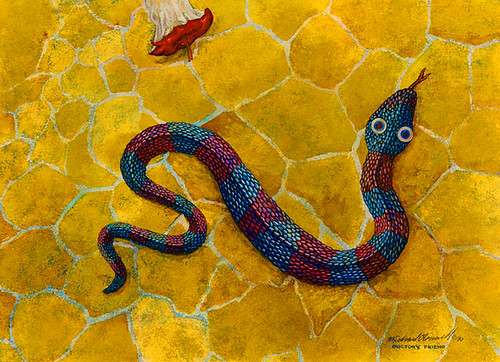
Intricate plots…
Intricate plans…
Physician's friend…
Harmful to man?
Intricate plans…
Physician's friend…
Harmful to man?
I have to admit… this is an old painting. I used to sit for hours in front of the television with my watercolors and get lost. Now it seems I spend more time on Lost than I do painting… much more time spent on family and the never-ending home renovations… This is one of a series of paintings in a very different style that was inspired by my wife when we first started dating… not that a snake or Adam and Eve really have much to do with us… it was just a new path in life…
This one is called Physician's Friend. Water Worries can be seen here. More Than A Mouthful here.
Spring Forward
Daylight Savings Time - STARTS 3/8/09
Before you go to bed tonight, set clocks ahead 1 hour.
As if we don't get too little sleep already.
Before you go to bed tonight, set clocks ahead 1 hour.
As if we don't get too little sleep already.
Friday, March 06, 2009
Subscribe to:
Comments (Atom)
