 Inspiration from across the sea! Creativity knows no bounds!
Friday, March 06, 2009
Monday, March 02, 2009
We Have a Winner!

I just received word that two recent logo designs will be included in the in the forthcoming book Initials & Crests, the first volume in the LogoLounge Master Library series. The selected indentities were developed for the Museum of Contemporary Art Jacksonville and Hercules.
The Avant Garde logo was designed while working in-house and was only used for about a year before the new agency redesigned it. This is the second time this logo has been selected for inclusion in a logo design book. The Dimension logo was designed for internal use at Hercules, a leading a provider of paper and water technologies.
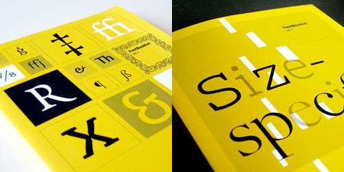
LogoLounge is currently building its Master Logo books. These books will showcase thousands of logos for specific, common logo types (the same categories found in the LogoLounge books), and will be a treasure of reference for logo designers around the world. LogoLounge has become an indispensable tool for logo research, logo inspiration, logo reference and an online portfolio for the international who's who in the corporate identity design community.
Type Tips – The Capital Mistake
 From FontShop founder Erik Spiekermann.
NEVER use CAPITAL letters to accentuate words in running copy. They STICK OUT far too much spoiling the LOOK of the column or page. Use italics instead. If you have to set words in capitals, use proper small caps with or without initial capitals.
For more from FontShop about setting type in all caps, read this post.
Saturday, February 28, 2009
Top Ten Typefaces Used by Book Design Winners
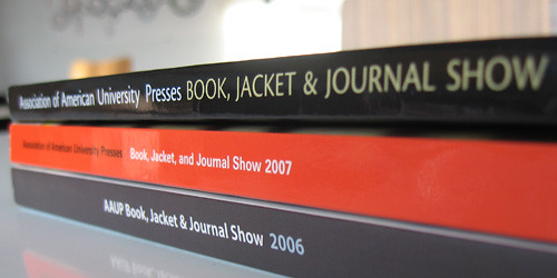 FontShop has an interesting article about the recent Book, Jacket & Journal Show sponsored by The American Association of University Presses (AAUP). The annual show catalogs the best in book design and exhibits it around the country. Below is a list of the most popular typefaces that were used in the designs. I can't help but notice that a couple of those near the top are fonts that come bundled with software.
The top ten:
1. Minion
2. ITC New Baskerville
3. FF Scala & 4. FF Scala Sans
5. Adobe Garamond
6. Trade Gothic
7. Electra
8. Fournier
9. Dante
10. DIN
Other popular typefaces used in AAUP winning entries:
Gotham, Helvetica Neue, Akzidenz Grotesk, Futura, Sabon, Bembo, Bodoni, Filosofia, Monotype Grotesque, Interstate, FF Quadraat Sans, FF Clifford
Thursday, February 26, 2009
Too Bad I'm Not in NYC
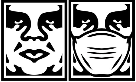
There has been a lot of discussion recently about Shepard Fairey's work. (More here and here.) I am sure almost everyone has heard about his run-in with the Associated Press. Now it seems he is preemptively suing the them. Oh the trials and tribulations of Fair Use! Regardless of where you stand on the subject, if you are a designer (or lawyer) you have to admit, it is an interesting story to follow. And tonight there is a great panel discussion at the New York Public library featuring Shepard Fairey, Steven Johnson and Lawrence Lessig, who is a Professor of Law at the Stanford Law School and founder of the Center for Internet and Society.
I think much of what he has done is sampling, but I'm not so sure I wouldn't change my tune if he "sampled" my work and made a bundle off it. And apparently, Shaepard Fairey, himself, feels the same way.
Subscribe to:
Comments (Atom)