Yesterday, I posted about CHAOS so it only seems fitting that today should be about CONTROL.
Wired's Clive Thompson has a very informative article about moderating discussion boards in the April issue. The article covers troll control or how to effectively moderate open discussion boards. He starts out with
“Obama sucks” and it’s all uphill from there with information on automated moderation like crowdsourcing and disemvoweling and selective invisibility. Take note that banning the offensive
“miscreants” only “
nurtures their curdled sense of being an oppressed truth-speaker.”Slashdot uses crowdsourcing to keep thier boards civil. A very basic explanation is that it is a rating system derived from comments about particular posts. The comments come from randomly selected readers who have the this commenting ability only for a short time before others are selected to comment. Disemvowelling is Thompson’s favorite and I would have to agree. Vicious attacks are almost rendered useless by removing all vowels from an offensive post.
Teresa Neilsen Hayden, a moderator at
Boing Boing uses this method. Selective Invisibility is the most diabolical of them all. The software by
Disqus (the company moderates 90,000 blog threads worldwide) is also a ratings based method. The difference here is that a troll with a lot of negative ratings is rendered invisible by everyone but himself.
This is what you get when you open your discussion boards to everyone. You can either hire an army to moderate your boards, eliminate those boards or employ some method to contain the damage. All of these methods walk a very fine line. One one side is a world where the very nasty troll reigns supreme. On the other is
Oceania and Big Brother.
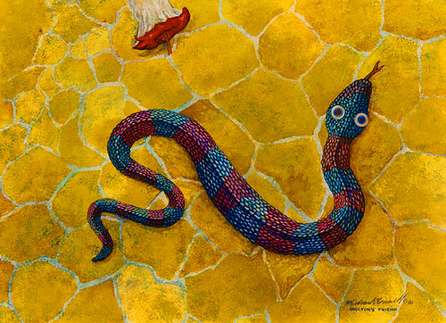
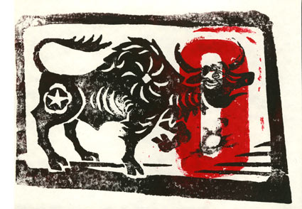
 About a month ago, I posted my entry for Illustration Friday. My thumb has just about recovered from the abuse of all the carving it took. It is a lot of work but so worth it. It was a woodblock of an ox and offered the remaining few in trade. One of my IF friends, Susan Sanford of ArtSpark Theatre, took me up on the offer. I just received this amazing piece of art. I'm certain I got the better end of this deal.