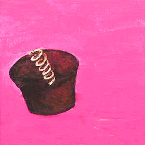
Last week the museum where I work, MOCA Jacksonville, held an opening for an amazing new exhibition called Imagination Squared. It was a huge collaborative effort by a wide cross-section of people. I participated, just barely, but I am so thankful that I pushed myself and got mine square in with only seconds to spare before the deadline. I am happy, too, not only because I am part of this great event, but also because this was the first time I used acrylics in over 20 years. I suppose it is a little like a bicycle… once you learn…
At any rate, this little painting seemed the perfect fit for this week’s Illustration Friday prompt. I would love to be saying that it is the start of a rededicated weekly practice, but life is still throwing fast balls and I'm still swinging. Soon, dear friends. Soon.
Recently, I have been doing a lot of work as part of the Riverside Avondale Preservation marketing task force. We have been assessing every nook and cranny. Planning for the future and digging into the past which is only fitting seeing as how RAP's started out as a historic preservation organization. Since 1974 it has helped the residents navigate the city's historic preservation code. It started the popular Luminaria, Tour of Homes and recently launched the wildly successful Riverside Arts Market. But I digress… one of the things we realized is that we wanted a fresh, new look… something that would catch the spirit of the district… We still have a lot of work to do… many miles to go before we sleep.
There’s an interesting post over at Marketing Profs commenting on a whitepaper from 360i Digital Connections. The whitepaper, Twitter & the Consumer-Marketer Dynamic is loaded with information on who uses Twitter and how it is used. You’ll have to put aside the fact that they only studied 1,800 tweets over a six month period when, by Twitter’s own numbers “Twitter has more than 100 million registered users that log a collective 65 million tweets each day.”
The interesting story that both the whitepaper and the commentary at Marketing Profs tell is that Twitter is used “primarily for people, not corporations. More than 90% of tweets come from consumers… and only 12% of consumer tweets mention a brand.” Further, the study informs us that “…94% of tweets are personal (vs. professional/self-promotional), 92% of users keep their tweets public, and 85% of tweets reflect original content (non-RTs).” To me these numbers tell a pretty obvious story, but the whitepaper goes on to tell us that “the opportunity for marketers to become part of the conversation remains vast.”
Twitter, like all social networking sites is opt-in. That means, people are only there because they want to be there. Over at Facebook, the story is a little different. For now, you can “Like” a business or organization’s page and you will receive updates to your wall but you can still opt out if the story is not intriguing or delivering a payoff for listening to their message.
I believe that social networking has exploded in recent years because people are so inundated with advertising and marketing that they need a break and can now take it. If marketers jump in with their old models, they will soon find that their words are falling on deaf ears. Mad Men-style advertising, while fun to watch, is dead. The old agencies are sucking air and still blowing smoke but a new day is dawning. Listening is now the key and the consumer is taking back control.
The Super Bowl was fun this year. No blow out. The ads were a little disappointing. There were some goods ones early on but it seemed, they slowly moved on. One we didn't see… no not the so-called "banned" one… was an ad from across the pond. It is worth taking a look…
Dragons are mythical creatures that populate almost every culture on earth so I find it hard to believe that they have always been creatures of man's imagination. I do believe that there was once a creature that inspired all the stories and know that I would not like to meet it in the wilderness.
This is a logo that I created for a youth soccer team. Below the logo is a crest that the team used on their jerseys. For those of you who didn't know today is Appreciate a Dragon Day so it is only fitting that this logo finally makes an appearance. Is that my geekiness showing again? Can't help that.
I've been a little stuck recently. Work has kept me busy, as has the home remodel and family life in general. AND most recently, my wife and I spent a little time in Dublin, Ireland. It was a wonderful and much-needed trip. I think the holidays will be doing me in a bit for the next few weeks, but I will start the New Year’s Resolutions early, so hopefully, I will be posting more. I will definitely be writing more AND illustrating more as I now have three (possibly four) books to illustrate!
Speaking of writing more, the image above is from the finished story I participated in via Twitter a while back. I am one of the Twitterverse as I contributed to the story at least four times. I'm not sure if I can now be categorized as a “published” author… but it was fun never-the-less. You can download the story at the BBC Audio America site.
No time this week but I did come across some very interesting work over here. I am continually amazed by people's creativity. Speaking of which, I have been having great fun participating in a project by BBC Audiobooks America. I saw a post that read "You can write an original audiobook story on Twitter with New York Times Bestselling Author Neil Gaiman!" and since I do like a good read, I couldn't resist. Neil started out the story and let the Twitterverse take it from there. I've even managed to add a number of tweets to the storyline. If you are interested, you can catch up on the storyline at their blog, head on over to @BBCAA and get in on the fun. The project runs through Friday. At least that is where they believe it will end. The response has been great and they have exceeded their limit a number of times. I look forward to hearing the final story. From a social media aspect, the project has been a great success as well. So far, they have almost quadrupled their followers!
Hope to catch you all again real soon.
germ, n. A pathogenic microorganism; something that may serve as the basis of further growth or development: the germ of a project;
The first thing that sprang to mind was something that causes disease. And every day I look at the news and see that our world is diseased… too many people in this world claim to speak for God… claiming that their way is THE way… but it isn't just the radical Muslims spreading their poison, although we see their terror most visibly… we are almost all guilty of it… every time we judge another… every time we point our fingers… every time we turn our backs… every time we put ourselves first… every day…
John Steinbeck said “A sad soul can kill quicker than a germ.” Too true. Life is moving way too fast… everyone feels it… we all need to slow down and think about the repercussions of our actions… take the time to see who we pass on the street… say hello to the stranger… smile… and let that be the germ that spreads… try it… you'll see…
This is a recently completed illustration that I created for a series of lectures here at MOCA. It has been a while since I gave a talk but I KNOW that my fears are magnified when I step up in front of any crowds. And it doesn't matter how much I prepare, I still get the cold, clammy feeling. Thankfully, that feeling is quickly replaced, especially when I have connected with my audience.
I've always been a big fan of artists like NC Wyeth, Frank Godwin, Virginia Sterritt and the like. Old school illustrators with talent to spare. They were before my time but copies of the books they illustrated sent me on my own incredible journeys and, I am quite certain, sparked the love of all things fantastic - books, comics, movies and more. They transport me back in time to when I was a pirate or a cowboy… times when I had less worry and responsibility… times gone by… For the most part, those artists have all left us. Some carry the tradition onward, thankfully. My fav is Charles Vess. Even his name is reminiscent of the masters from days gone by. His new book, Drawing Down the Moon is soon to be released. One of his many collaborations with author Neil Gaiman can be seen here with commentary from the artist. It is worth a look. I plan to get it when it is released.
The TED series is amazing. I have posted a few in the past. Sagmeister is brilliant here. He reminds me about the fun one can find in design… especially when you are open to new ideas.
I sure do miss Illustration Friday. Thanks to all my friends who have checked in on me over my hiatus and wished me well. Every week I get my e-mail announcing the topic and I am determined to participate… and for a long while, every week I have been pulled in one direction or another. Much of it has been fun. I took my daughter to Universal Studios and road roller coasters. The whole family spent a week in San Diego – the zoo, Sea World, people watching at Comicon, and a week with my oh so fab cousin Annie and her new family. And then there's WORK. It has been a roller coaster ride this summer. I spent June working on website designs for Taleo. The fruits of my labor should be live soon. Freelance projects kept me jumping and then there's MOCA. With all the trips and contract work, I spent much of my time either catching up or making free time.
And I almost forgot… silly me… if you didn't see my earlier post… I dusted off my acting muscles for the 48 Hour Film Project and was part of an award-winning short film. We took home "Best Picture", among others… AND I was fortunate enough to be a part of a group show at MOCA Jacksonville… the work was old… but it did help to light a fire under my…
Waaaaaaaahhhhhhhhhhh!! There it is. I got it out. And I also managed to get an illustration out. And some day I'm going to buy one of these little guys myself and do a little modifying. For now, check these cool designs out!
I recently had the opportunity to work on the 48Hour Film Project. Loads of work… lots of fun… We took home the Best 48 Hour Film Project Award as well as the Best Actress, Best Writer and Best Effects awards. Kudos to all who worked on the film, especially Daniel Irizarry, Glen Vanderolen, Manuel Aragon and Jay Pennington who made this film happen. And to the other actors who brought this film to life. And thanks for letting me be a part of it.
Wired’s Geek Dad is a fun place to visit. Even if you aren’t a Dad, you'll find fun things to read and a weekly puzzle to challenge your brain. Yesterday, Wired writer Dave Giancaspro told us how he keeps his kids creative (and organized) while still having fun.
So many toys these days have a limited range of play and few options for taking them beyond their intended use. I’ve heard many times from parents and kids to “Just build it the way it’s supposed to be!” The beauty of The Lego Lost and Found Box is there’s no picture on the box. Read more>>
So true. We all like to complain, but then we all allow our children to sit in front of the screen – TV, computer, gaming console – the list goes on and on. Our children deserve better. Our world deserves better.
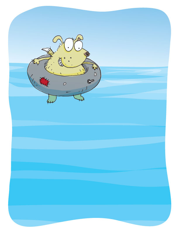
Bugsy can't swin… not even the dog paddle… poor dog… but he still knows how to have fun… adapt or sit on the sidelines!
I've been away from Illustration Friday for way too long. Every Friday, I receive the e-mail and it only made me long for a few minutes, hours or days as it sometimes would take me to participate. I know I only grow as an artist when I do, but I haven't been slacking. Above is one of the many illustrations or logos that I have worked on since I last visited all those weeks ago. I hope my online friends haven't forgotten me. I surely haven't forgotten you.
I’ve been a member of Marketing Profs for years now. The amount of professional generosity never ceases to amaze me… nor does the stupidity but that is another post entirely. Len Kendall's post “that people are starting to view the Google search bar as their URL entry box” might be a little late out of the box but it should be enough to have you ignoring the rest of this post and typing your company's name in the search bar.
Glad you made it back. What did you see? Was it enough to make you realize that all your carefully planned branding efforts might very well be sharing space with some very unsavory company… and worse… your competition. What am I talking about? Search again and this time take notice of all of the other information in the search results. That's what consumers do.
Len Kendall references Josh Catone’s post at Read, Write, Web. This insightful post informs us about a possible new trend forming here in the States. Trends show that the way people search and the increased use of the mobile web, among others, should be enough for you to consider changing your web strategy. Kellogg’s went as far as purchasing the top sponsored search result for "Special K" on Yahoo! and Google to support their TV ads. Maybe the future is branded search results as Allen Stern of Center Networks points out.
Search over URL is here to stay. And even if you can't afford a national ad campaign or the purchase of top spots in search results, you do have the resources to provided your customers with a well-thought-out and well-designed web site. Evaluate the keywords and content on your site. Eliminate all the junk you think is necessary and simplify your message.
Sometimes the obvious just isn't so obvious until you bring in a professional… or two. Brand New has a post about the retooled Swanswell brand by Brand Guardians. They went on to hire johnson banks to handle the design chores. Swanswell is an agency that helps people with their drug and alcohol dependencies, said, ‘give me a brand my people and service users deserve’.
After the usual “brand strategy ‘thing’ (capabilities, competition, customers, vision and mission etc)” they had their ah-ha moment and started to explore the possibilities of using the “well” at the end of the company’s name. “Various typographic experiments followed, before the discovery that a piece of paper, crumpled at one end, could act as a suitable metaphor for someone's life smoothing itself out.”
Brand Guardian's Jonathan Mercer points out that he “never tire[s] of telling them brand development is less about invention, and more about archeology. We know the solution is ‘in there somewhere’, it just has to be revealed.” I always knew that, I guess I just hadn't seen it said so well.
The simplicity of this design is nothing short of brilliant.
Some numbers add up, and others don’t – no, it’s not your tax return. It’s the difference between proportional and tabular numerals. Know which style you need before you choose a typeface and you’ll reap a big savings in time and effort.Tabular numerals are those where each numeral has the same total character width (that’s the width of the numeral itself plus the white space on both sides). Tabular spacing (also referred to as monospacing) allows numerals to align vertically in tables, financial statements and other columns of figures. Tabular figures are usually lining figures, meaning that they sit on the baseline and have the same height as the capital letters, but on occasion you’ll see old style figures that are tabular. (Old style figures are also called lowercase or non-aligning figures.)On the other hand, display typefaces usually contain proportional figures. The total character widths of these figures are based on the width of the numeral itself plus a small amount of white space around it, so an 8 takes up more width than a 1, for example. Proportional figures can be of the lining or old style variety. In either case, their varying widths give them a more even color and texture, especially around the numeral 1. Proportional figures are not intended for use in charts and tables, since they won’t align in vertical columns.When selecting a font for a project, think about how you’ll be using numerals in your design and make sure the font you choose offers the style of figures you need. While it’s fairly simple to kern a tabular 1 to improve its spacing in a text setting, it’s nearly impossible to kern proportional numerals for vertical alignment in a financial statement.For maximum flexibility, consider using OpenType fonts, which are becoming available from more and more foundries. This new font format often comes with both tabular and proportional figures in both lining and old style varieties, but requires using an application that supports this feature.
Editor’s Note: Ilene Strizver, founder of The Type Studio, is a typographic consultant, designer and writer specializing in all aspects of typographic communication. Read more about typography in her latest literary effort, Type Rules!, published by North Light Books. This article was commissioned and approved by Monotype Imaging Inc.
If you’re a graphic designer and work on a Macintosh system, chances are you typically use PostScript® Type 1 fonts. If you primarily do web design, or work on a Windows machine, you probably use your share of TrueType fonts. Both formats have their advantages and disadvantages, but now there’s OpenType – offering the best of both worlds, and much more.New FeaturesOpenType is a kind of superset of Type 1 and TrueType font formats, with added enhancements. It is backward-compatible with applications that support Type 1 and TrueType fonts (including design applications and printer drivers), and you can mix OpenType fonts with other font formats without a problem.OpenType also offers some remarkable new features that require OpenType-compatible applications. (If you’re using the latest version of your operating system and applications, you may already have this capability – check with the manufacturers to be sure.) Three of these new features that are of particular benefit to designers are multi-platform support, expanded character sets and glyph substitution.Read more about the features…
Editor’s Note: Ilene Strizver, founder of The Type Studio, is a typographic consultant, designer and writer specializing in all aspects of typographic communication. Read more about typography in her latest literary effort, Type Rules!, published by North Light Books. This article was commissioned and approved by Monotype Imaging Inc.