Monday, April 27, 2009

Type Tips – Proportional Vs Tabular Figures


by Ilene Strizver, founder of The Type Studio

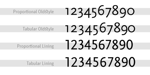
Some numbers add up, and others don’t – no, it’s not your tax return. It’s the difference between proportional and tabular numerals. Know which style you need before you choose a typeface and you’ll reap a big savings in time and effort. Tabular numerals are those where each numeral has the same total character width (that’s the width of the numeral itself plus the white space on both sides). Tabular spacing (also referred to as monospacing) allows numerals to align vertically in tables, financial statements and other columns of figures. Tabular figures are usually lining figures, meaning that they sit on the baseline and have the same height as the capital letters, but on occasion you’ll see old style figures that are tabular. (Old style figures are also called lowercase or non-aligning figures.) On the other hand, display typefaces usually contain proportional figures. The total character widths of these figures are based on the width of the numeral itself plus a small amount of white space around it, so an 8 takes up more width than a 1, for example. Proportional figures can be of the lining or old style variety. In either case, their varying widths give them a more even color and texture, especially around the numeral 1. Proportional figures are not intended for use in charts and tables, since they won’t align in vertical columns. When selecting a font for a project, think about how you’ll be using numerals in your design and make sure the font you choose offers the style of figures you need. While it’s fairly simple to kern a tabular 1 to improve its spacing in a text setting, it’s nearly impossible to kern proportional numerals for vertical alignment in a financial statement. For maximum flexibility, consider using OpenType fonts, which are becoming available from more and more foundries. This new font format often comes with both tabular and proportional figures in both lining and old style varieties, but requires using an application that supports this feature.

Editor’s Note: Ilene Strizver, founder of The Type Studio, is a typographic consultant, designer and writer specializing in all aspects of typographic communication. Read more about typography in her latest literary effort, Type Rules!, published by North Light Books. This article was commissioned and approved by Monotype Imaging Inc.

Monday, April 20, 2009

Type Tips – Open Type


by Ilene Strizver, founder of The Type Studio

If you’re a graphic designer and work on a Macintosh system, chances are you typically use PostScript® Type 1 fonts. If you primarily do web design, or work on a Windows machine, you probably use your share of TrueType fonts. Both formats have their advantages and disadvantages, but now there’s OpenType – offering the best of both worlds, and much more.
New Features OpenType is a kind of superset of Type 1 and TrueType font formats, with added enhancements. It is backward-compatible with applications that support Type 1 and TrueType fonts (including design applications and printer drivers), and you can mix OpenType fonts with other font formats without a problem. OpenType also offers some remarkable new features that require OpenType-compatible applications. (If you’re using the latest version of your operating system and applications, you may already have this capability – check with the manufacturers to be sure.) Three of these new features that are of particular benefit to designers are multi-platform support, expanded character sets and glyph substitution. Read more about the features…

Editor’s Note: Ilene Strizver, founder of The Type Studio, is a typographic consultant, designer and writer specializing in all aspects of typographic communication. Read more about typography in her latest literary effort, Type Rules!, published by North Light Books. This article was commissioned and approved by Monotype Imaging Inc.

Monday, April 13, 2009

Type Tips – Bullets


From FontShop founder Erik Spiekermann

Use bullets or centered points instead of hyphens (-) when you list items. Bullets are part of the standard character set and are located in the following positions:
option-8 (Mac), ALT+0149 (Windows)
· option-shift-9 (Mac), ALT+0183 (Windows)

Tuesday, April 07, 2009

I Don't Deserve This

About a month ago, I posted my entry for Illustration Friday. My thumb has just about recovered from the abuse of all the carving it took. It is a lot of work but so worth it. It was a woodblock of an ox and offered the remaining few in trade. One of my IF friends, Susan Sanford of ArtSpark Theatre, took me up on the offer. I just received this amazing piece of art. I'm certain I got the better end of this deal.

As for Illustration Friday itself, hopefully, once tax season, Easter and spring break (whew!) are out of the way I can get back to being a bit more regular and friendly.

Monday, April 06, 2009

Type Tips – Not Justified

From FontShop founder Erik Spiekermann

Avoid flush settings! Most applications create justified text by hideously stretching and squishing words and spaces. Note that it takes many hours of tedious work to typeset justified text that is truly well-proportioned and legible. For this reason, professionals prefer to use ragged-right composition, either with or without hyphenation, depending on how much line-length variation they wish to allow. This gives the text a more harmonious appearance and makes it easier to read, since all wordspaces have the same width.

If you are up for a history lesson on the origins and use of justified typesetting, ITC's U&lc tackles the subject quite well. And please people, there is no such thing at right- or left-justified type!

Monday, March 30, 2009

Type Tips – Ligatures


From FontShop founder Erik Spiekermann

A ligature is defined as the visual or formal combination of two or three letters into a single character. They consist of letter combinations such as ff, fi, fl, ffi. Ligatures keep letters from overlapping and improve legibility. For example: affluence, configure, deflate, affinity.

For more info on ligatures, kerning and tracking the Design Center has a pretty good article posted.

Wednesday, March 25, 2009

conTROLL

Yesterday, I posted about CHAOS so it only seems fitting that today should be about CONTROL.
Wired's Clive Thompson has a very informative article about moderating discussion boards in the April issue. The article covers troll control or how to effectively moderate open discussion boards. He starts out with “Obama sucks” and it’s all uphill from there with information on automated moderation like crowdsourcing and disemvoweling and selective invisibility. Take note that banning the offensive “miscreants” only “nurtures their curdled sense of being an oppressed truth-speaker.”

Slashdot uses crowdsourcing to keep thier boards civil. A very basic explanation is that it is a rating system derived from comments about particular posts. The comments come from randomly selected readers who have the this commenting ability only for a short time before others are selected to comment. Disemvowelling is Thompson’s favorite and I would have to agree. Vicious attacks are almost rendered useless by removing all vowels from an offensive post. Teresa Neilsen Hayden, a moderator at Boing Boing uses this method. Selective Invisibility is the most diabolical of them all. The software by Disqus (the company moderates 90,000 blog threads worldwide) is also a ratings based method. The difference here is that a troll with a lot of negative ratings is rendered invisible by everyone but himself.

This is what you get when you open your discussion boards to everyone. You can either hire an army to moderate your boards, eliminate those boards or employ some method to contain the damage. All of these methods walk a very fine line. One one side is a world where the very nasty troll reigns supreme. On the other is Oceania and Big Brother.

Monday, March 23, 2009

Type Tips – Figuring It Out

From FontShop founder Erik Spiekermann

Good text typefaces have “old style”, “text”, or “lowercase” figures – 1234567890 – instead of “lining” ones – 1234567890. Lining figures were originally designed to be used with setting of all capital letters. Lowercase figures blend in better with the text settings, as the figures behave like lowercase letters with ascenders (6 and 8) and descenders (3, 4, 5, 7, 9) and x-height-only characters (1, 2, 0). While they fit in text very nicely, the good looks have one disadvantage: each of the figures have individual widths, meaning they won’t sit directly underneath each other in columns. Their descenders may also clash with ascenders when the columns sit closely on top of one another, as happens quite often in tabular settings. Lining figures are, however, all the same width, making for a somewhat uneven appearance, as the 1 takes up the same space as the 8, but in tables, they are much easier to add up. Some fonts offer “tabular oldstyle figures”, which will allow table setting.

Read more about figure styles.

Friday, March 20, 2009

Legendary

I guess I have been on somewhat of a superhero kick recently and last week's IF prompt Legenday fits the bill so I did a quick sketch of the Man of Steel. I had lunch with a friend last week and he told me about a story about Richie Havens. Havens. The story he related shared a number of life lessons that Richie Havens learned and how they revealed themselves at strange and unexpected times throughout his life. One of those awakenings was in the 1950s and tales of playing stickball growing up in Brooklyn, inspiring his mother’s wrath (“If your mother doesn’t believe you, no one will…”) and explaining his admiration for Superman as being driven by the fact that he “did what the cops couldn’t do”. HIs father told him that there were no heroes like the ones in the comic books, but I would imagine that somewhere inside he held on to the belief that somewhere this were such being. The George Reeves "Superman" television show changed it all for him and even at a young age got him thinking about the world we live in. This incarnation of the man from Krypton added a little something to the Superman mythology and in so doing revealed a little something about this great country in which we live. “Truth, justice AND the American way.” Four words added to the tagline opened his eyes. It also made him think. We always thought truth and justice WAS the American way. “You see how they fool us."

Monday, March 16, 2009

Type Tips – Smart Quotes

From FontShop founder Erik Spiekermann

A dead giveaway for unprofessional “desktop typography” are wrong quotes and apostrophes. Quotes can have different shapes. They generally look like “this”, and can be remembered as beginning and ending quotes by thinking of “66” and “99”. Beginning quotes are found on the Mac by pressing option-[; closing quotes, option-shift-[. The apostrophe is simply a raised comma, the shape of a ’9 in most typefaces. It is identical to the closing single quote, while the open single quote looks like a ‘6. Beginning single quotes are found on the Mac by pressing option-]; the apostrophe and closing single quote, option-shift-].

And don't get me started on the use of apostrophes. I can't tell you how many times I have tried to fill out a form online only to be told that I need to use a “correct name”. If you are a programmer, please include the apostrophe character. I really want to be correct. U&lc also covers this quite well.

Monday, March 09, 2009

Type Tips – Connections

From FontShop founder Erik Spiekermann

There are three different ways to connect or separate words: the hyphen -, the en dash –, a little wider than the hyphen, and the em dash —, wider still. The regular hyphen is easily accessible on any Mac or PC keyboard, whereas the en dash needs the combination option-hyphen on the Mac. The em dash is accessed by pressing option-shift-hyphen on the Mac. The use of these dashes depends on house styles and tradition. The em dash with no space around it is traditionally used to separate thoughts—like this one—but I think its length is a distraction in running text. Try using the en dash to separate thoughts – like this one – with a character space on either side. En dashes without space on either side are also used between numbers and compound words as in: the shop is open 10–7, while you can take the New York–Kansas City train or the New York–Baltimore train only 8am–3pm.

This is a good, if overly-simple, description of usage from Washington State University. And if that wasn't simple enough for you keep this in mind “Dashes tend to separate elements and hyphens to link them.”

Saturday, March 07, 2009

Illustration Friday - Intricate


Intricate plots…
Intricate plans…
Physician's friend…
Harmful to man?

I have to admit… this is an old painting. I used to sit for hours in front of the television with my watercolors and get lost. Now it seems I spend more time on Lost than I do painting… much more time spent on family and the never-ending home renovations… This is one of a series of paintings in a very different style that was inspired by my wife when we first started dating… not that a snake or Adam and Eve really have much to do with us… it was just a new path in life…

This one is called Physician's Friend. Water Worries can be seen here. More Than A Mouthful here.

Spring Forward

Daylight Savings Time - STARTS 3/8/09
Before you go to bed tonight, set clocks ahead 1 hour.

As if we don't get too little sleep already.

Friday, March 06, 2009

Monday, March 02, 2009

We Have a Winner!


I just received word that two recent logo designs will be included in the in the forthcoming book Initials & Crests, the first volume in the LogoLounge Master Library series. The selected indentities were developed for the Museum of Contemporary Art Jacksonville and Hercules.

The Avant Garde logo was designed while working in-house and was only used for about a year before the new agency redesigned it. This is the second time this logo has been selected for inclusion in a logo design book. The Dimension logo was designed for internal use at Hercules, a leading a provider of paper and water technologies.

LogoLounge is currently building its Master Logo books. These books will showcase thousands of logos for specific, common logo types (the same categories found in the LogoLounge books), and will be a treasure of reference for logo designers around the world. LogoLounge has become an indispensable tool for logo research, logo inspiration, logo reference and an online portfolio for the international who's who in the corporate identity design community.

Type Tips – The Capital Mistake

From FontShop founder Erik Spiekermann.

NEVER use CAPITAL letters to accentuate words in running copy. They STICK OUT far too much spoiling the LOOK of the column or page. Use italics instead. If you have to set words in capitals, use proper small caps with or without initial capitals.

For more from FontShop about setting type in all caps, read this post.

Saturday, February 28, 2009

Top Ten Typefaces Used by Book Design Winners

FontShop has an interesting article about the recent Book, Jacket & Journal Show sponsored by The American Association of University Presses (AAUP). The annual show catalogs the best in book design and exhibits it around the country. Below is a list of the most popular typefaces that were used in the designs. I can't help but notice that a couple of those near the top are fonts that come bundled with software.

The top ten:
1. Minion
2. ITC New Baskerville
3. FF Scala & 4. FF Scala Sans
5. Adobe Garamond
6. Trade Gothic
7. Electra
8. Fournier
9. Dante
10. DIN


Other popular typefaces used in AAUP winning entries:

Gotham, Helvetica Neue, Akzidenz Grotesk, Futura, Sabon, Bembo, Bodoni, Filosofia, Monotype Grotesque, Interstate, FF Quadraat Sans, FF Clifford

Thursday, February 26, 2009

Too Bad I'm Not in NYC


There has been a lot of discussion recently about Shepard Fairey's work. (More here and here.) I am sure almost everyone has heard about his run-in with the Associated Press. Now it seems he is preemptively suing the them. Oh the trials and tribulations of Fair Use! Regardless of where you stand on the subject, if you are a designer (or lawyer) you have to admit, it is an interesting story to follow. And tonight there is a great panel discussion at the New York Public library featuring Shepard Fairey, Steven Johnson and Lawrence Lessig, who is a Professor of Law at the Stanford Law School and founder of the Center for Internet and Society.

I think much of what he has done is sampling, but I'm not so sure I wouldn't change my tune if he "sampled" my work and made a bundle off it. And apparently, Shaepard Fairey, himself, feels the same way.

The People vs. George Lucas

This looks fun, if not anything else. I don't know if we'll ever see it though. Their website was launched in 2007 and still says that it's coming soon to a theater near you.

Wednesday, February 25, 2009

Instinct - Illustration Friday

Sometimes something just feels right… or wrong…

Intuition is the ability to know things without reasoning or inferring… simply put… you just know something to hold truth. Right now our economy is a mess. We know this. We can't help but knowing this. Everywhere we go we are told how bad things are. And while it may be true, I think most of what we are dealing with is greed. Unfortunately, due to the Bush bailout and the Obama stimulus package those who created this mess don't have to live with the consequences of their greed. The banks and financial institutions who got more and more creative in their interpretation of the laws and basic good sense are now the happy recipients of our money. The automakers who refused to look at the big picture and keep mass-producing SUVs and trucks are facing ruin and the gift of our money. Then there are our neighbors who made a bundle flipping real estate… who bought way more than they could afford… who drive those big SUVs because we are Americans dammit and have the right… the stock traders who drive Wall Street with rabbit's feet and fly balls…

And through it all… good people suffer… hard working people lose their jobs because someone higher up in the food chain got greedy or lazy or just plain stupid… people who made good decisions and saved and didn't double and triple mortgage their houses to buy a new car or take a trip now get to pay the mortgages of our neighbors…

And through all of it… our intuition tells us that this is all very, very wrong… does anyone have an answer?