The rambling thoughts of an author including art, rants, words, book reviews, not-so-subtle suggestions, and more…
Tuesday, June 06, 2006
Illustration Friday - Portrait
So, I am back and busy as ever. I have a few deadlines to keep so I'm just going to have to dig deep. This one is from the late eighties. It is one of my faves.
beautiful portrait...and colors contrast... Thanks for your kind message on my blog...your sensation about my text was right!!!!I'm so happy to read you again
This is wonderfully done! I like the blue tones throughout the whole piece. I must say your words are so moving with your other posts. Especially the one of the David sign. Thank goodness for caring souls like you and your wife.
Thanks for your comment on my setter. It's my husband's passion - breeding and training english setters.
Such interesting color choices for this incredible portrait! I'm not sure who this man is, but you've really captured a quality here. Kind of looks a bit like Will Rogers...
Another wonderful illustration. He appears to be panning for gold; perhaps it is the gold shirt that takes me in that direction. Though his face says that he has yet to be successful and perhaps he is rethinking traveling all the way across the country to the land of sunshine and opportunity -- still more gold references. (thanks for your kind comments on my art)
This is fantastic. He looks so alive--The color and movement are so dynamic that he looks nearly more alive than the rest of us. Great stuff. I love to see other people's work from way back when...
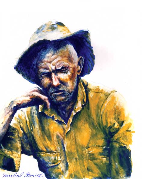
nice watercolor like the contrast between the purplish blue shadows and the yellowish orange shirt and welcome back
ReplyDeletebeautiful portrait...and colors contrast...
ReplyDeleteThanks for your kind message on my blog...your sensation about my text was right!!!!I'm so happy to read you again
Really really nice -- a lot of heart and grittiness in this!
ReplyDeleteThanks for your comment on my "found modern art" and good luck on your interview sequence, I'll be wishing good things for you!
This is wonderfully done! I like the blue tones throughout the whole piece. I must say your words are so moving with your other posts. Especially the one of the David sign. Thank goodness for caring souls like you and your wife.
ReplyDeleteThanks for your comment on my setter. It's my husband's passion - breeding and training english setters.
Wow. That's talent. Beautiful.
ReplyDeleteWOW Michael...you master so many different techniques! Cool! One big yeehaw! for this illo! :-)
ReplyDeleteOh! and I forgot...I loved your new blog banner design...reminds me of Magritte.
ReplyDeletebeatiful illo and great colours contrast...I like his expression as well; thanks for your kind comment
ReplyDelete:)
Oh my, you are headless! Oh, that's just your banner ;). Beautiful work, amazing portrait.
ReplyDeleteSuch interesting color choices for this incredible portrait! I'm not sure who this man is, but you've really captured a quality here. Kind of looks a bit like Will Rogers...
ReplyDeleteWow Michael!!! You've got talent man. This is remarkable--the colors and the expression on the man's face. Fantastic!!!
ReplyDeleteThanks, Michael, for your kind comment on my portrait post. Looking at your work, I can tell your opinion is to be valued. The cowboy is exceptional.
ReplyDeleteAnother wonderful illustration. He appears to be panning for gold; perhaps it is the gold shirt that takes me in that direction. Though his face says that he has yet to be successful and perhaps he is rethinking traveling all the way across the country to the land of sunshine and opportunity -- still more gold references.
ReplyDelete(thanks for your kind comments on my art)
the colors in this piece are beautiful.
ReplyDeleteSuper portrait! I like the painterly approach a lot!
ReplyDeleteWith him comes an all earnest earthiness. Terrific!
ReplyDeleteWoe, what a great piece of work, and the the colors used in this. Rugged and raw and so realistic. Beautiful!
ReplyDeleteThis is fantastic. He looks so alive--The color and movement are so dynamic that he looks nearly more alive than the rest of us. Great stuff. I love to see other people's work from way back when...
ReplyDeletewow, this is great. I love the colors and the expression. Not just a portrait. (;
ReplyDeletethis looks great, i love the colors.
ReplyDeleteThis portrait is awesome, Michael. You've got great talent.
ReplyDelete